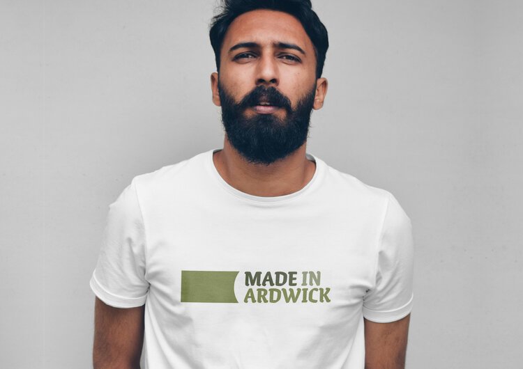
Classic t-shirt logo design
Made in Ardwick
Tips, Tricks & Features
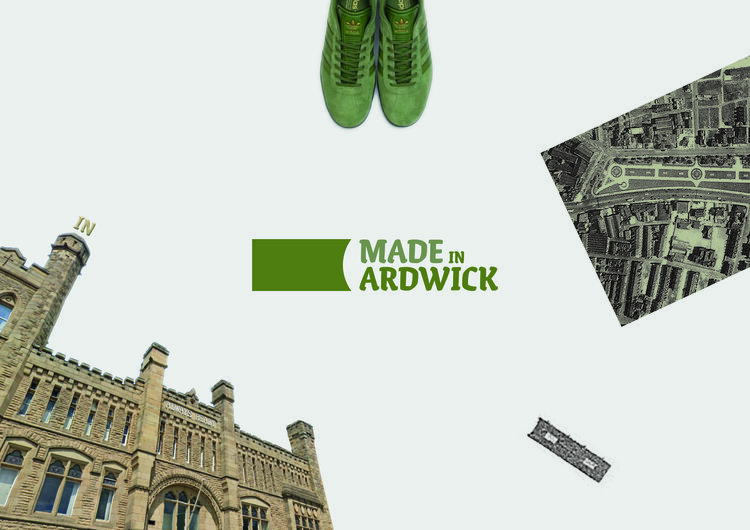
The shape, font and colours used in the identity was found through close research of the area of ardwick, most notably the famous ‘Ardwick green’.
The font echo’s the font used on the old barracks facing the green, The colour is in the name of the area, and the shape comes from an areal shot of a landscaped lawn area of the green itself.
Finding inspiration in the location of a project or product can help give an identity meaning, purpose and story.
Design and assets for festival held at Whitworth Art Gallery celebrating Ardwick. Inspiration taken from local history, Ardwick Green and the old barracks typography.


