GRAPHIC DESIGN
Verdino & Co – Logo & Brand Identity
Logo design and visual identity for a New York-based B2B marketing and communications agency.
Client: Verdino & Co (New York, USA)
Service: Logo Design / Brand Identity
Location: Long Island, New York
Year: 2022

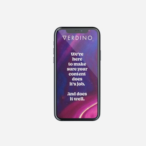
Verdino & Co is a B2B content and marketing communications agency based in New York, working across brand voice, campaign messaging and strategic content development.
The identity was designed to reflect clarity, precision and authority within a highly competitive communications sector. A simple but distinctive wordmark system was developed, with a geometric triangle forming the foundation of the visual identity and acting as a flexible graphic device across applications.
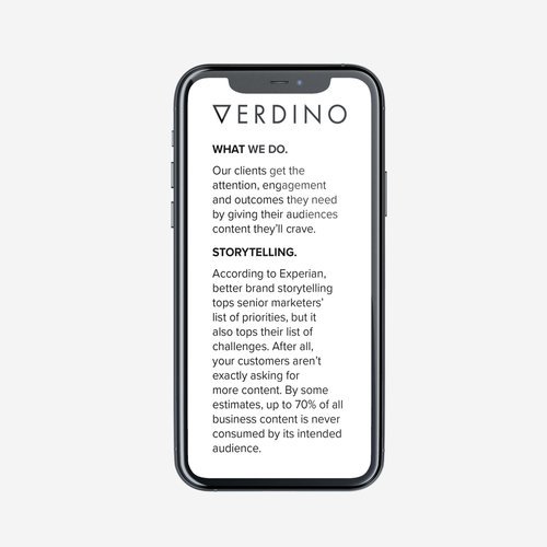
The system was designed for versatility across digital platforms, presentations, editorial content and client-facing communications, supporting a wide range of messaging formats from executive communications to campaign narratives.
The result is a clean, adaptable identity built to support both strategic thinking and high-volume content production.
See Adaptability Institute, Access Able, and Westminster Associates for other logo work.

“Micah has quickly become my go-to designer… I wholly recommend Micah and his work.”Co-founder Greg Verdino
