Book Design
Editorial design for books, catalogues and publications in art, culture and the public sphere
Shaping content into a coherent reading experience that is clear, tactile and memorable.


Micah Purnell designs books for artists, cultural organisations, charities and brands, combining editorial design, typographic direction and narrative structure.
Each project begins with pacing, sequence and form, shaping content into a coherent reading experience that is clear, tactile and memorable.
Working across monographs, exhibition catalogues and cultural publications, the focus is on creating books as considered objects where content, structure and material work together to support meaning and presence.
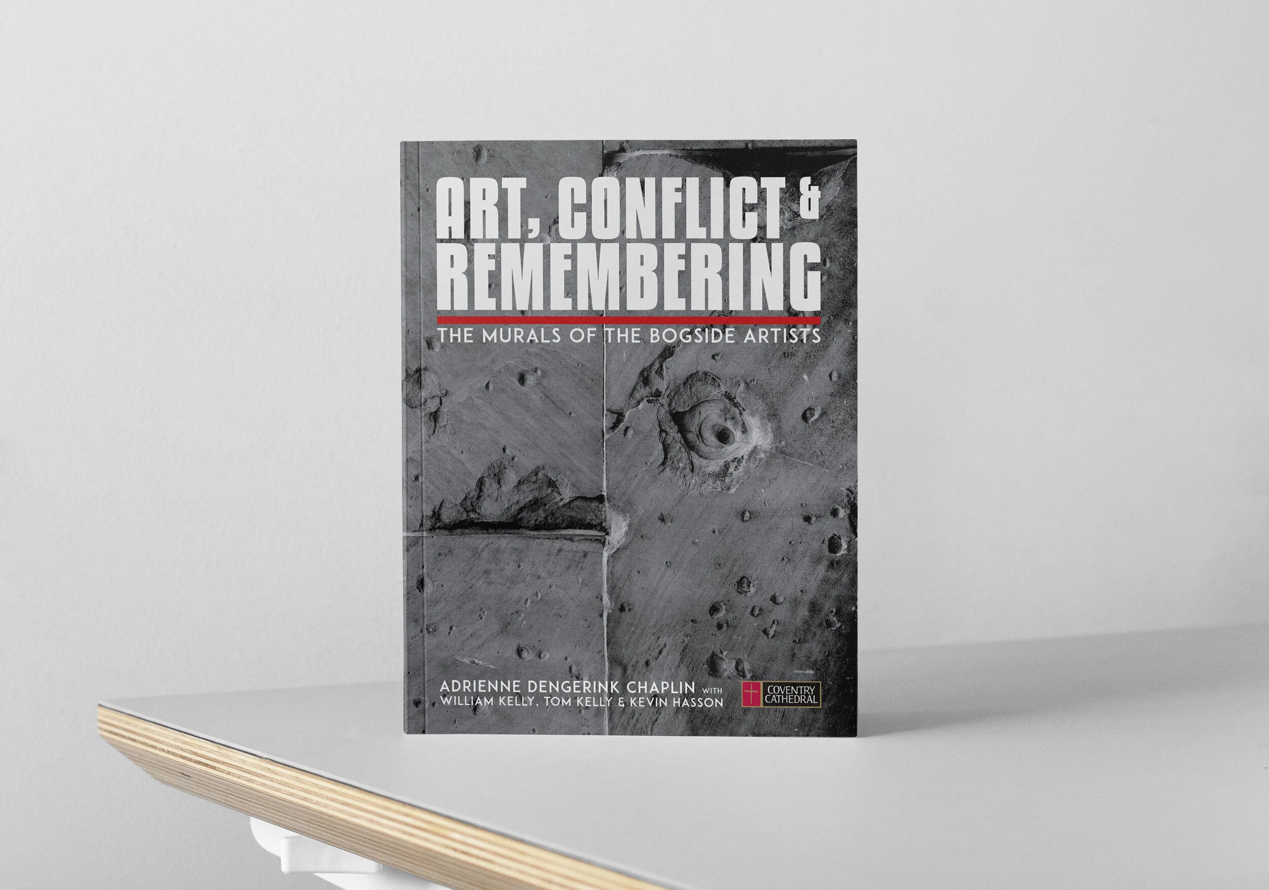
Self published book in collabortation with photographer Richard Harris of London, England.
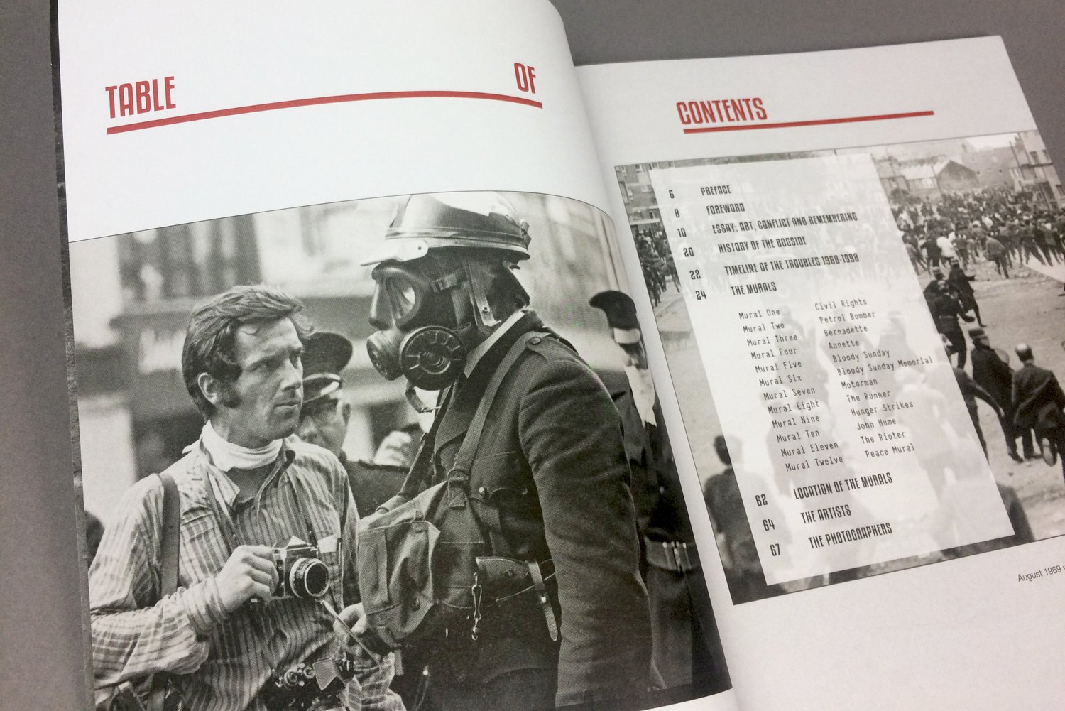
Client Adrienne Dengerink Chaplin
Task Book Design
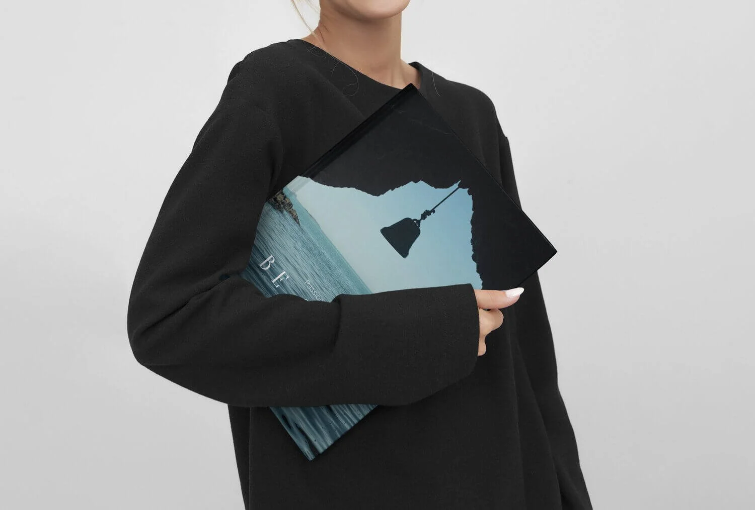
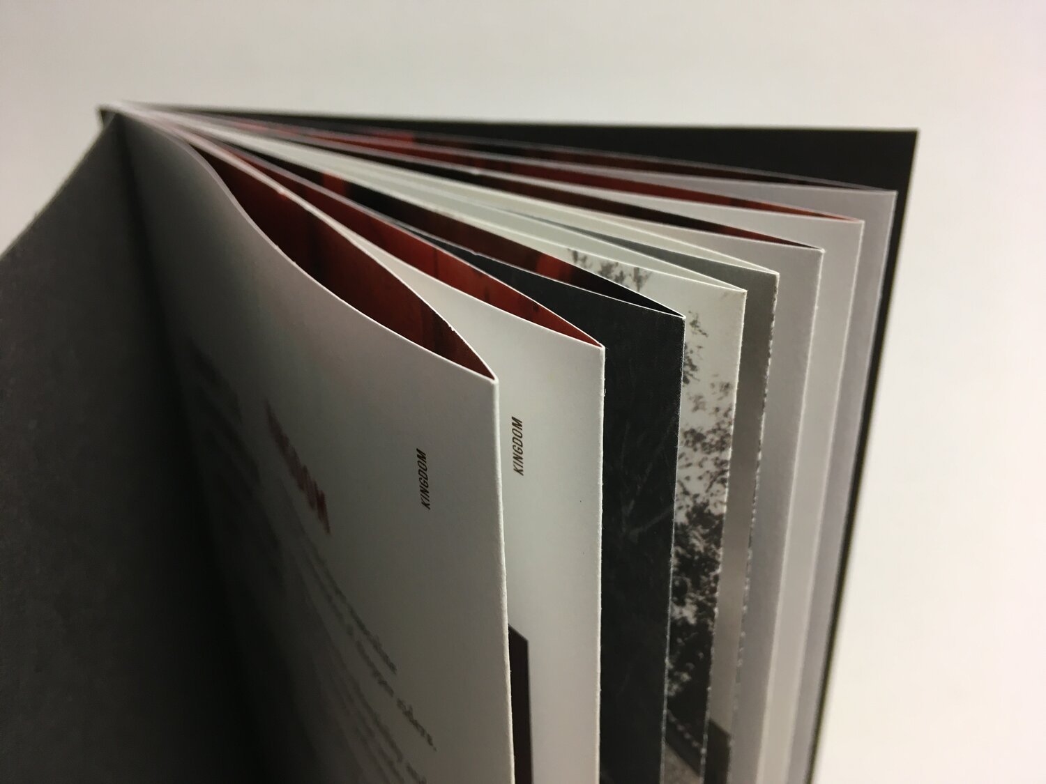
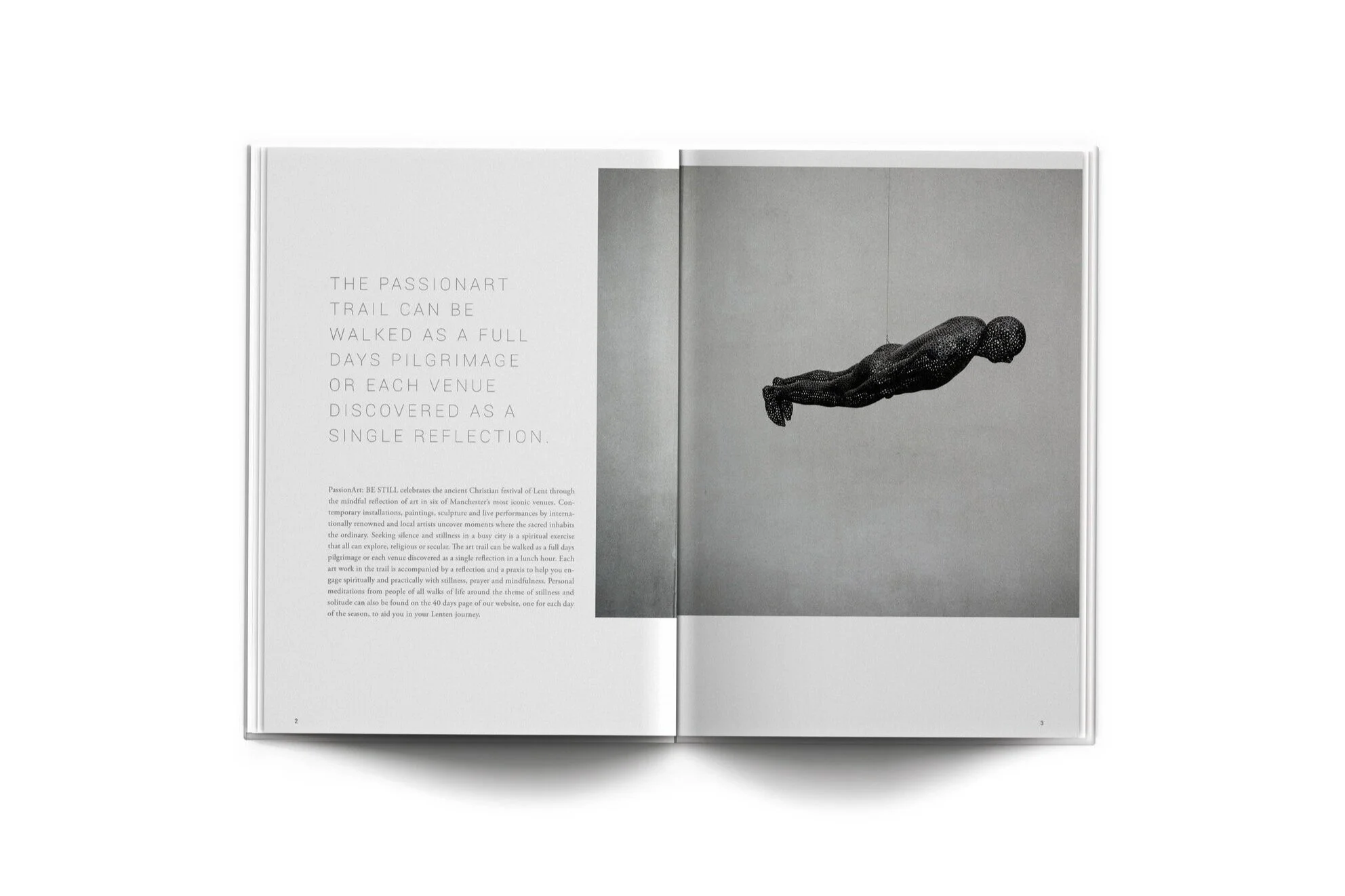
Special Features: Art Conflict and Remembering charts the murals of the Bogside Artists in Derry, Northern Ireland during The Troubles. The book was developed into a touring exhibition.
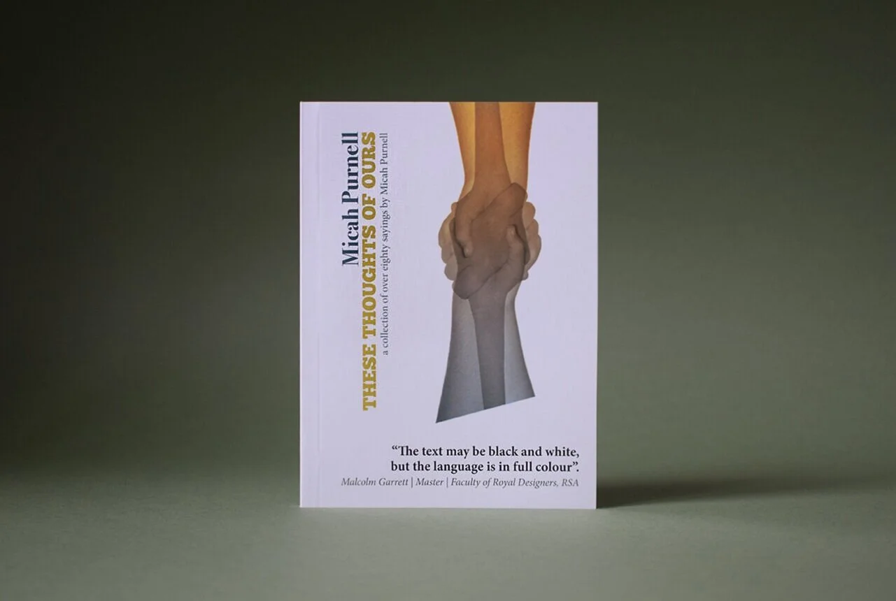
Client Self Published
Task Book Design
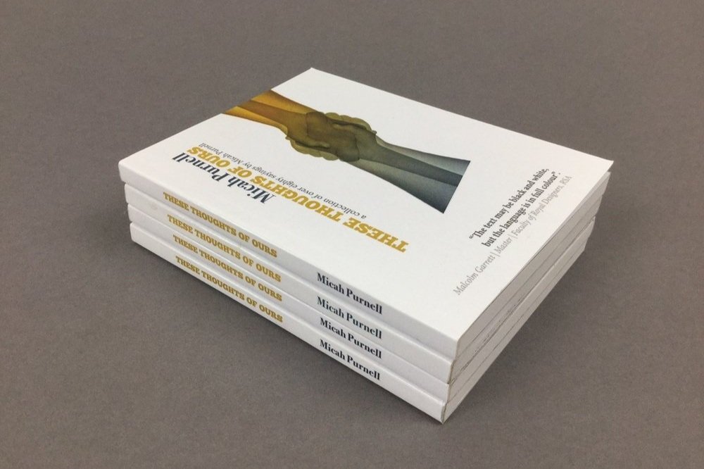
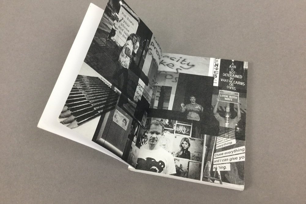
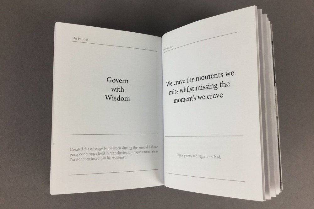
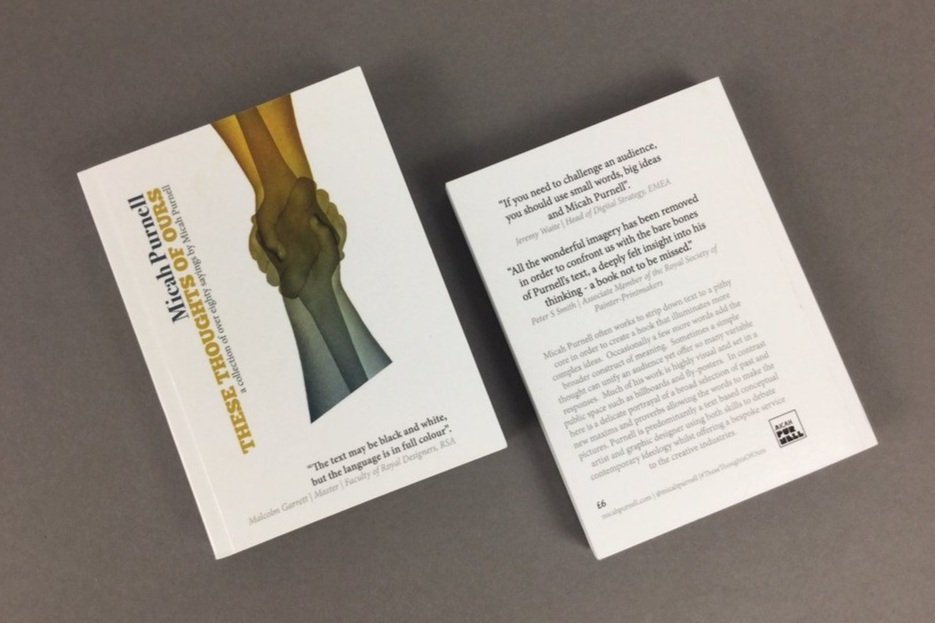
Special Features: A book of quotes from positive messaging to social critique.
Sold Out
Client Heath Street Baptist Church, Hampstead Heath
Task Book Design
Special Features: This piece used an eco friendly printing technique known as Risograph printing, using gold.
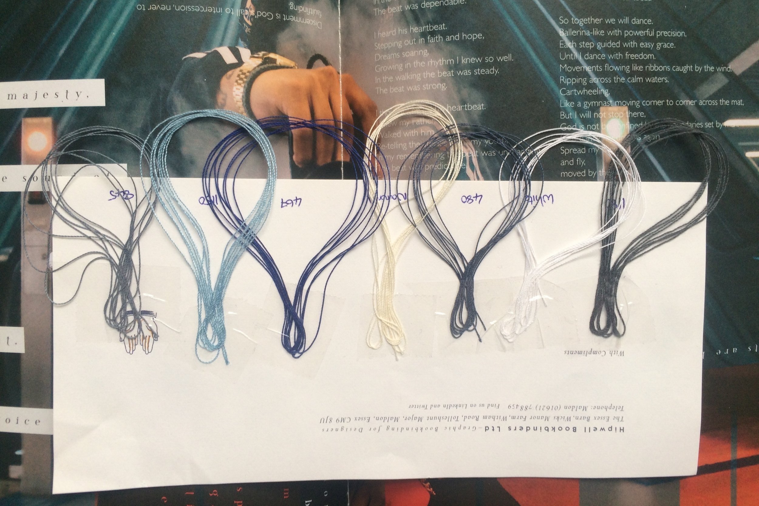
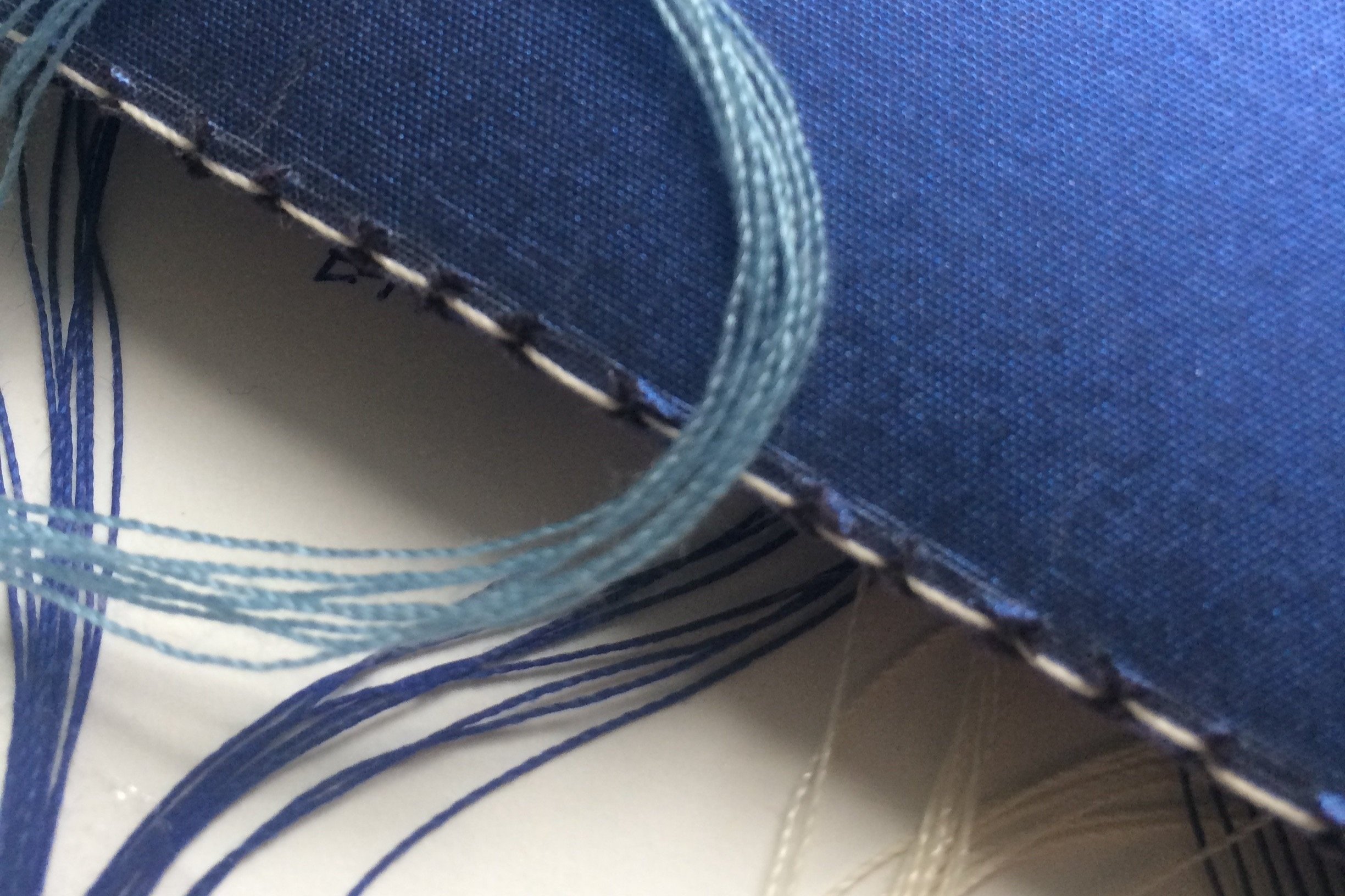
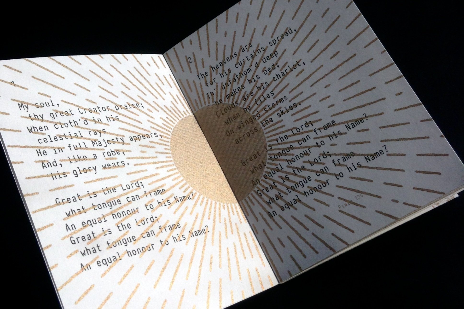
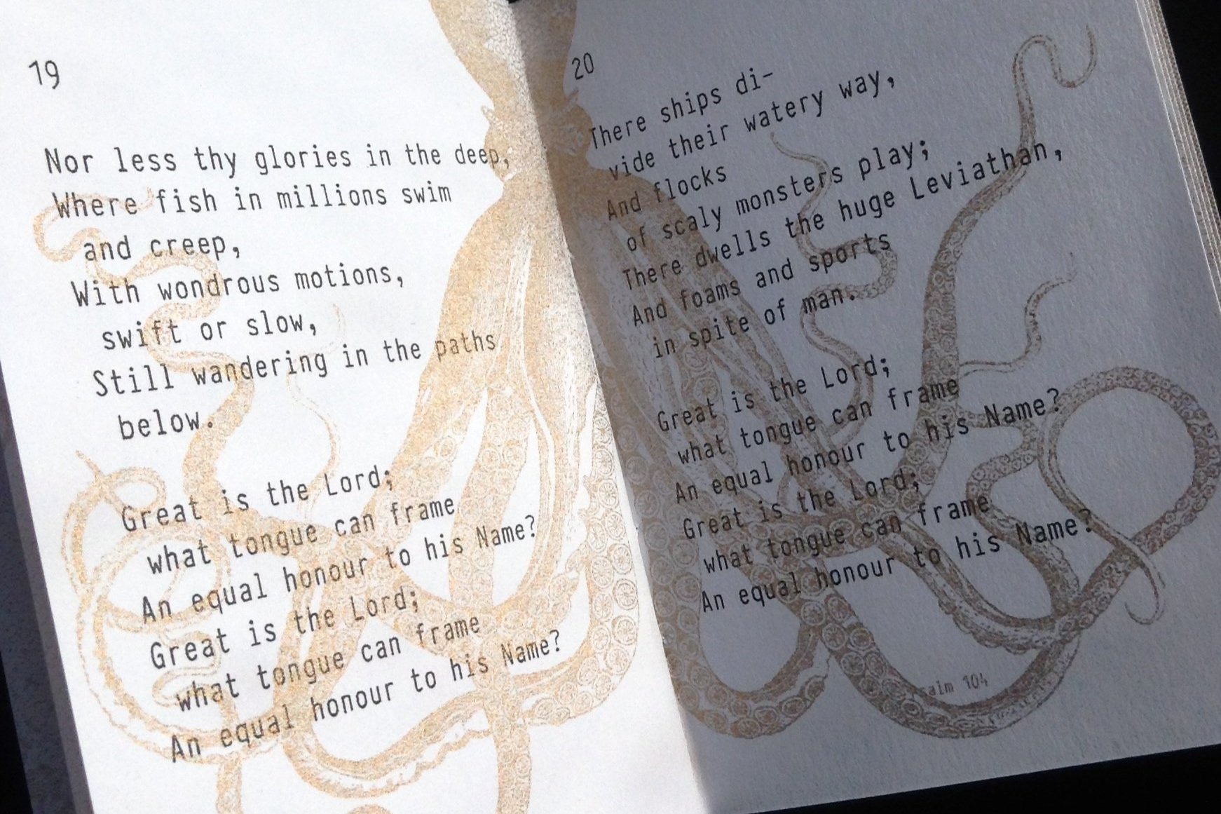
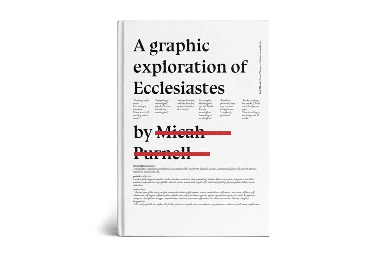
Client Bible Society / Andy Hunter
Task Book Design
Special Features: Initial ideas for sewn binding, cotton colours and lush metallic and textured G.F.SMITH papers.
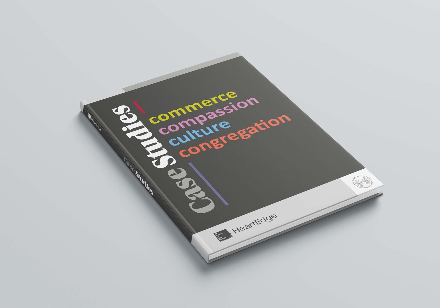
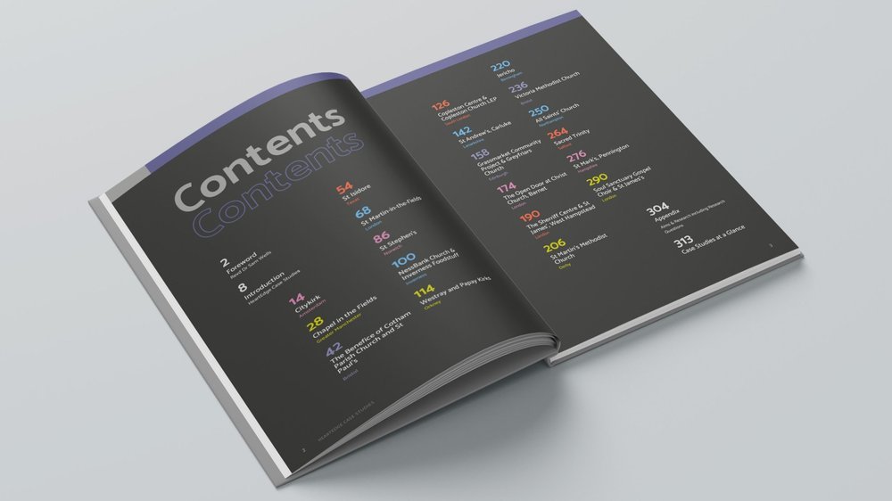
Client HeartEdge
Task 300 page Case Study
Special Features: Following and enhancing brand guidelines.
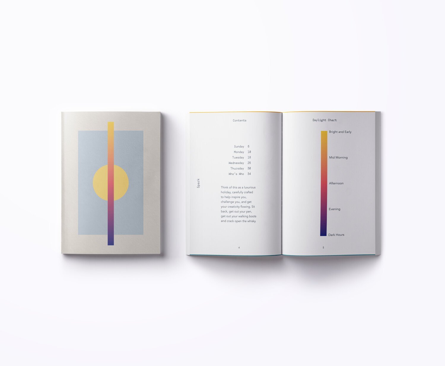
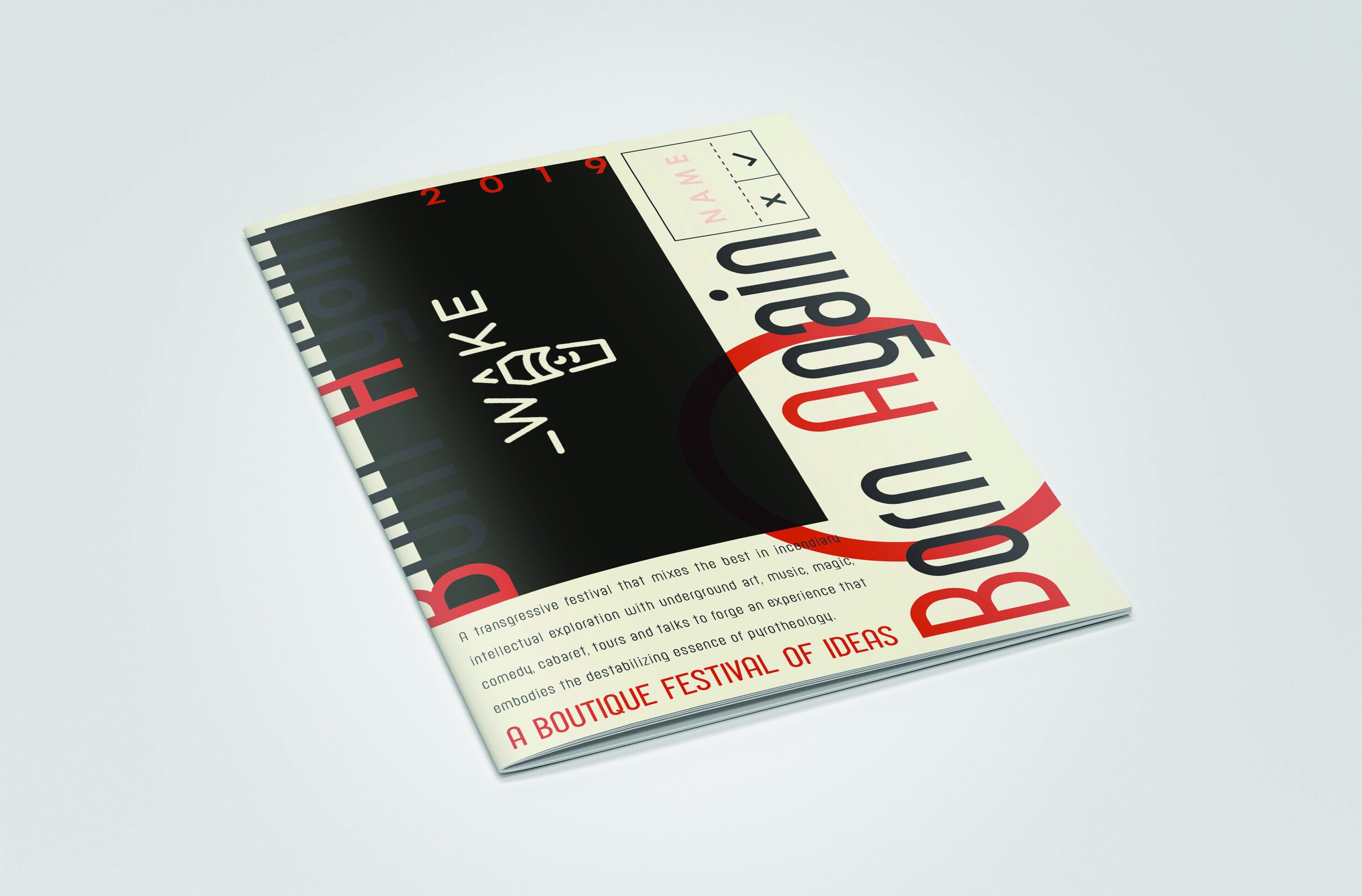
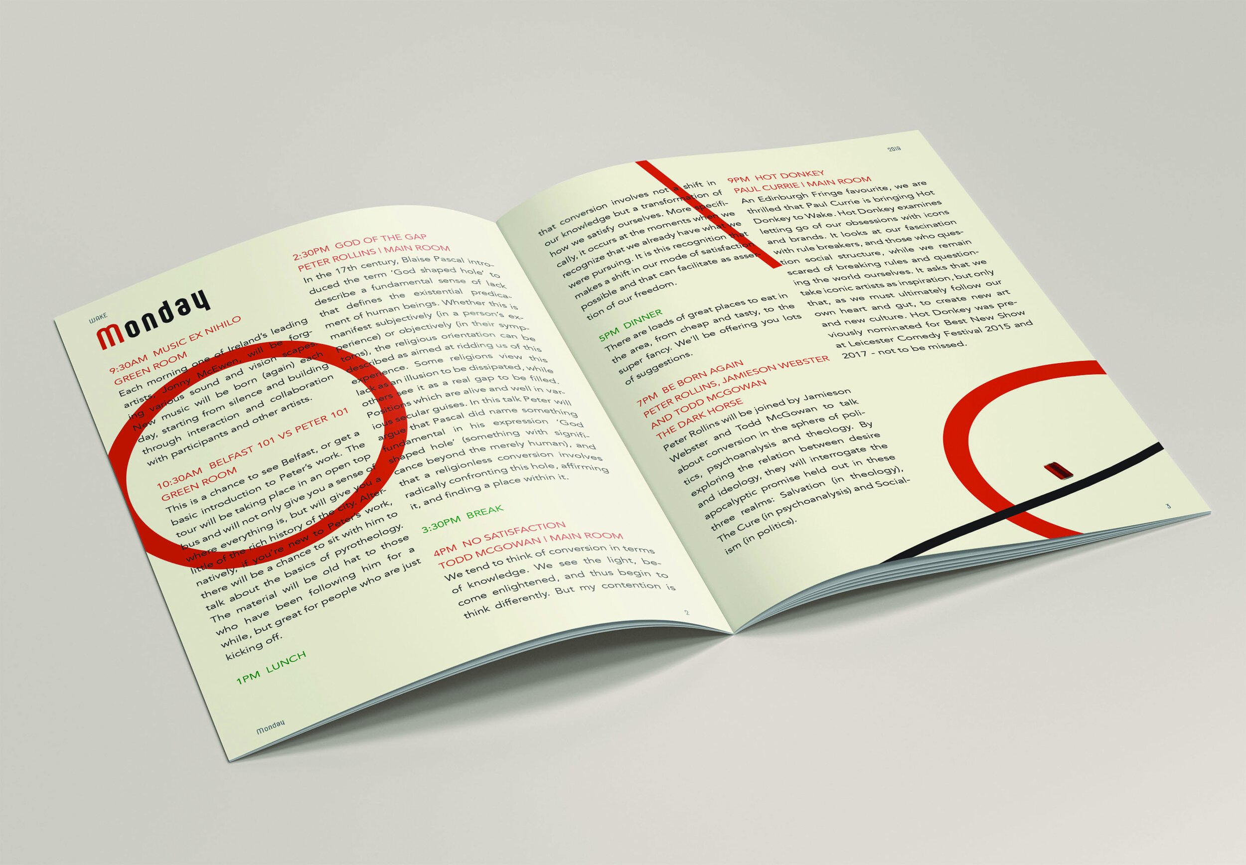
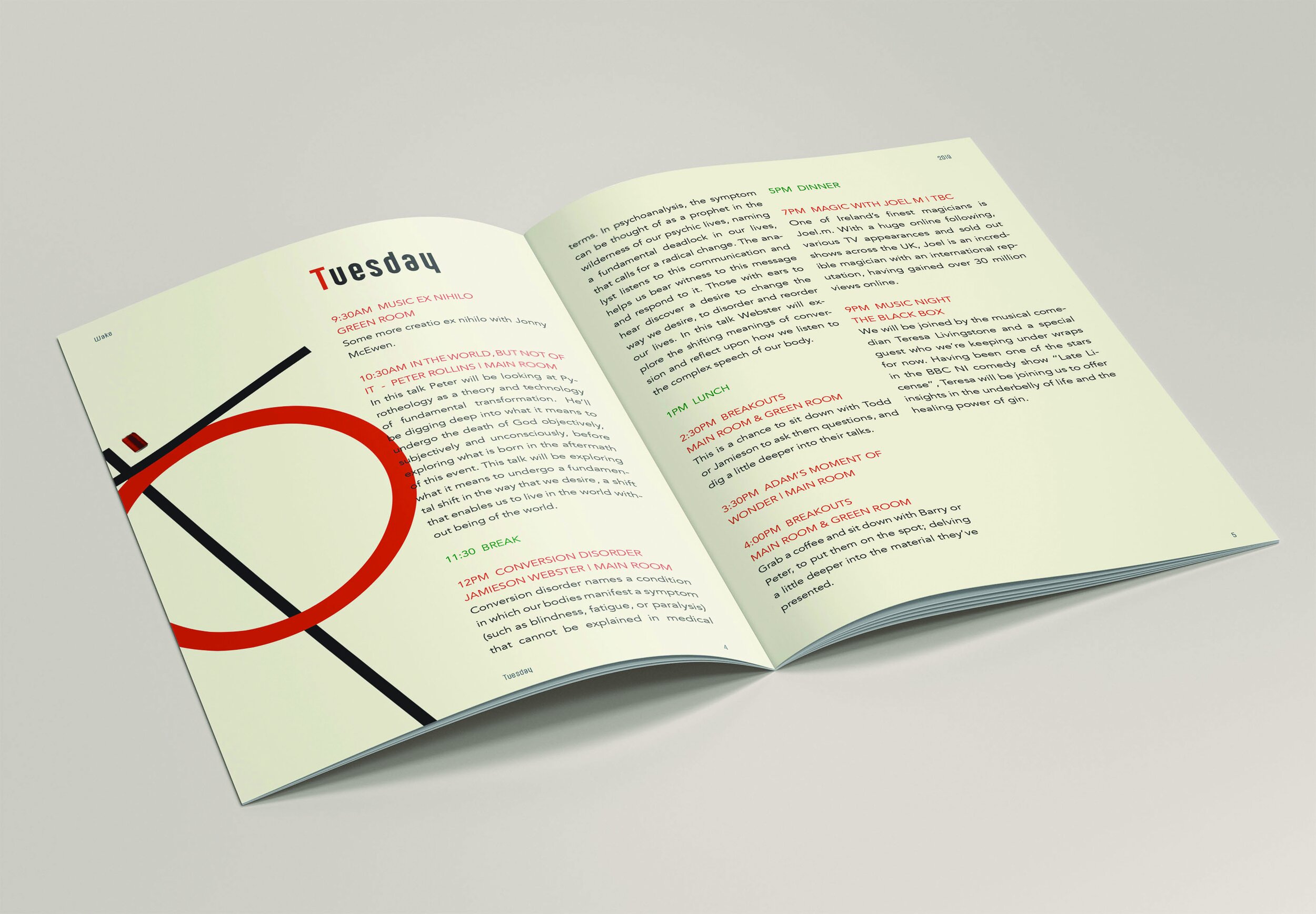
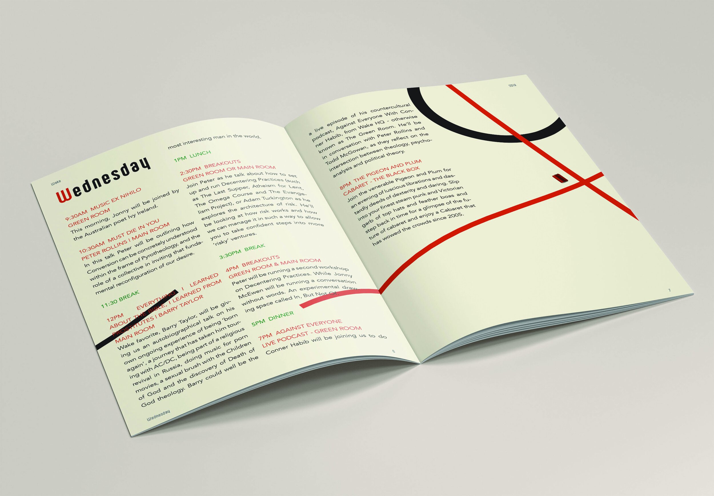
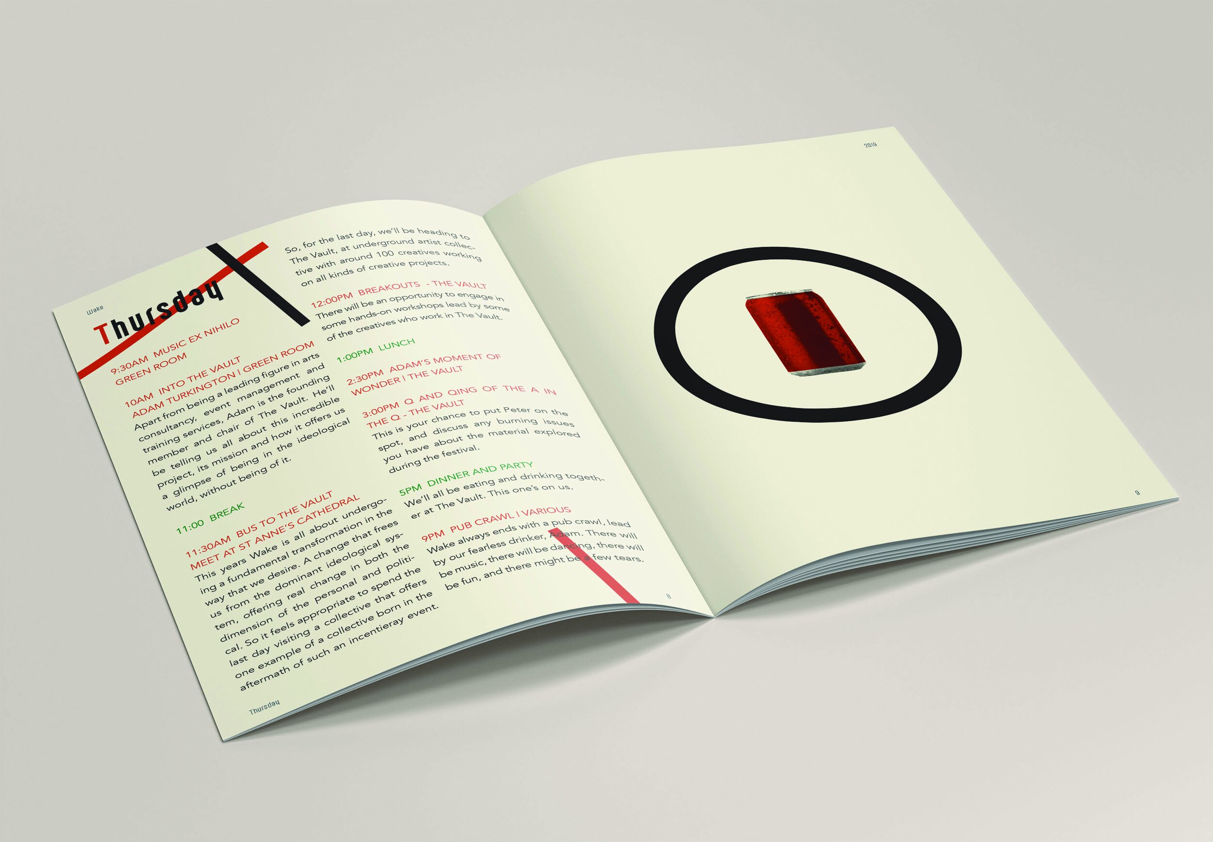
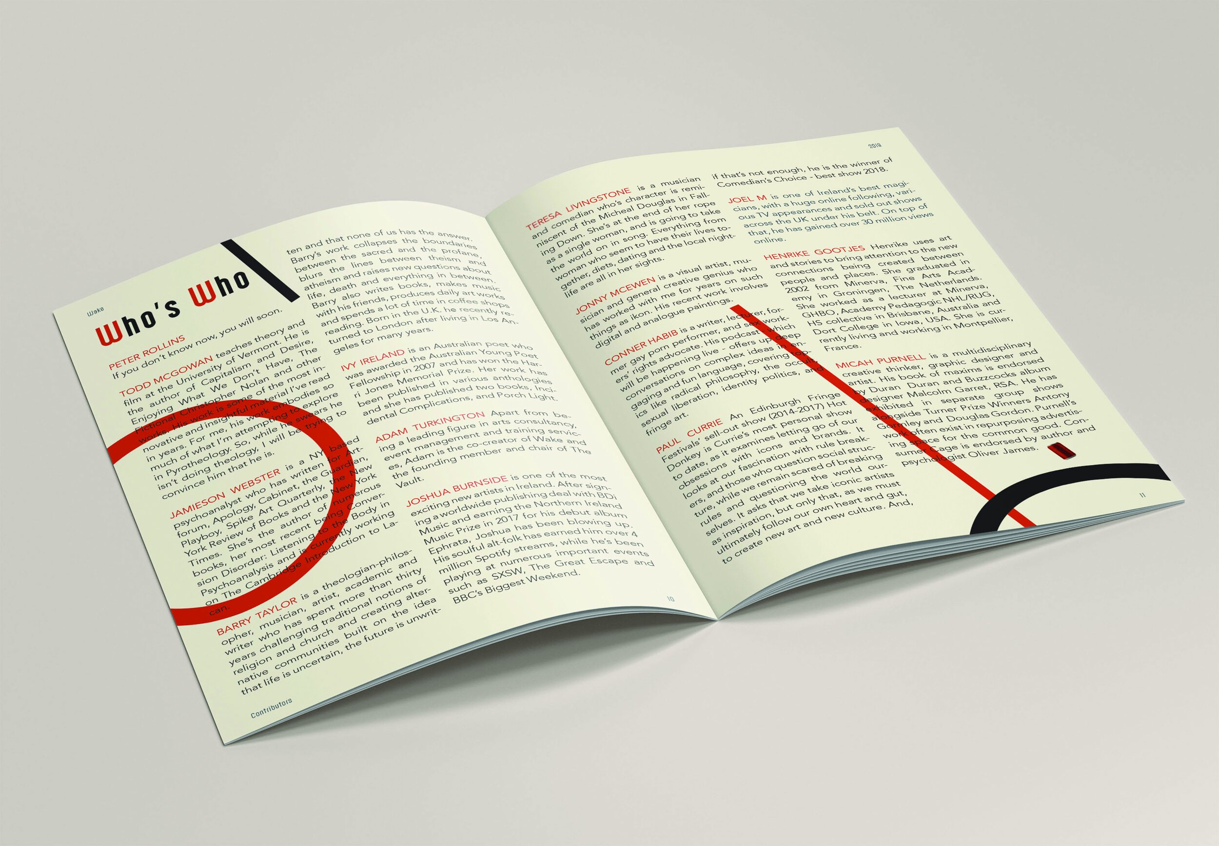
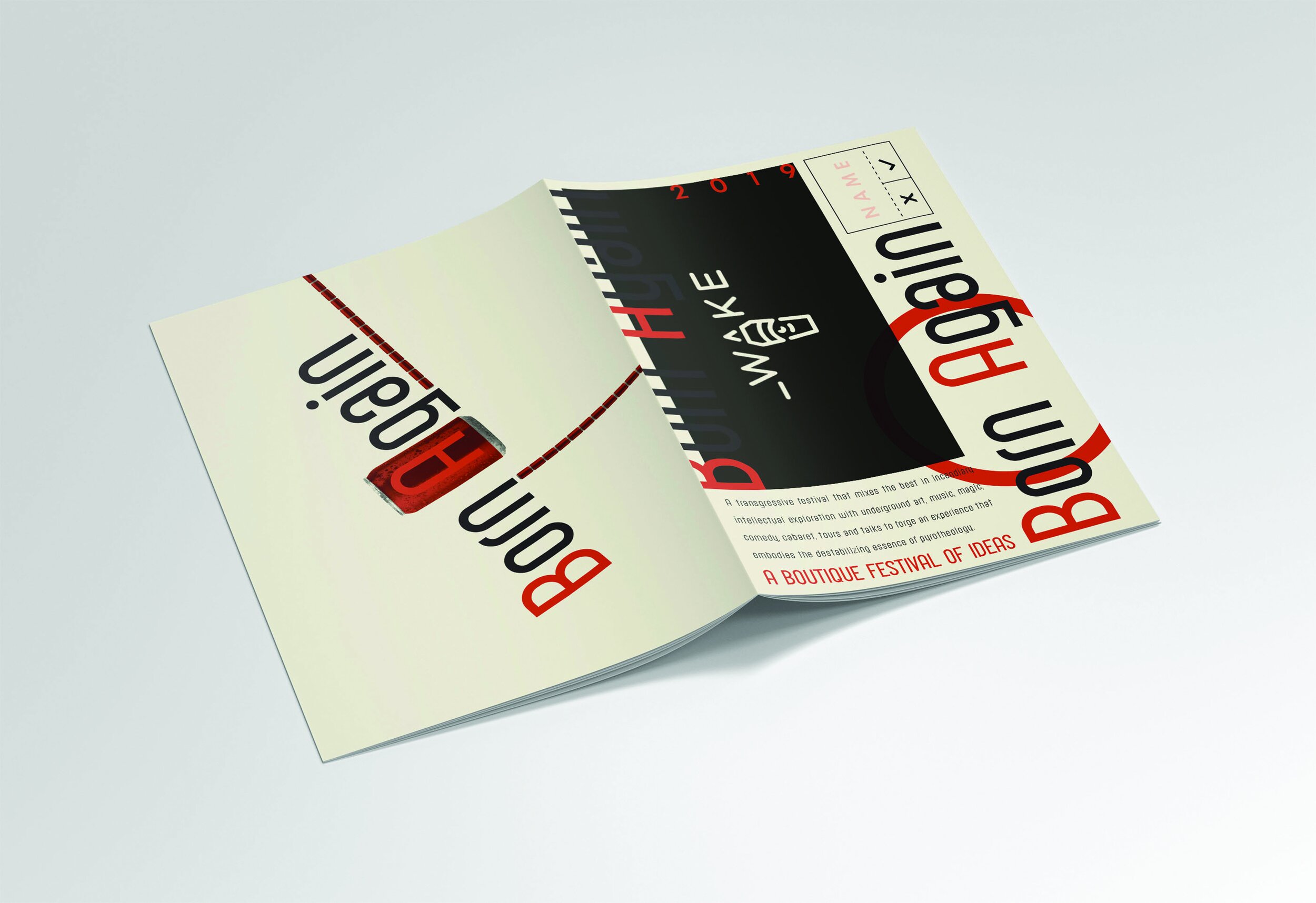
Client Peter Rollins
Task Event Program
Special Features: The book for Peter Rollins’ festival of ideas included a daylight-hours key, on each page, events were listed alongside a visual key for the time of day, from sunrise to the dark hours, as events ran from Coffee & Concepts, to late night whisky sessions.
Client Self Publishing
Task Book Design
Special Features Currently none, it’s just an idea so please don’t email about ordering.
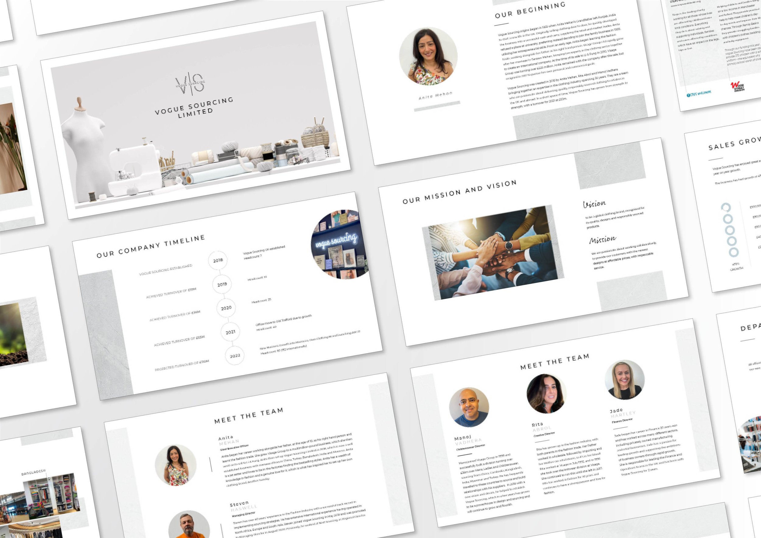
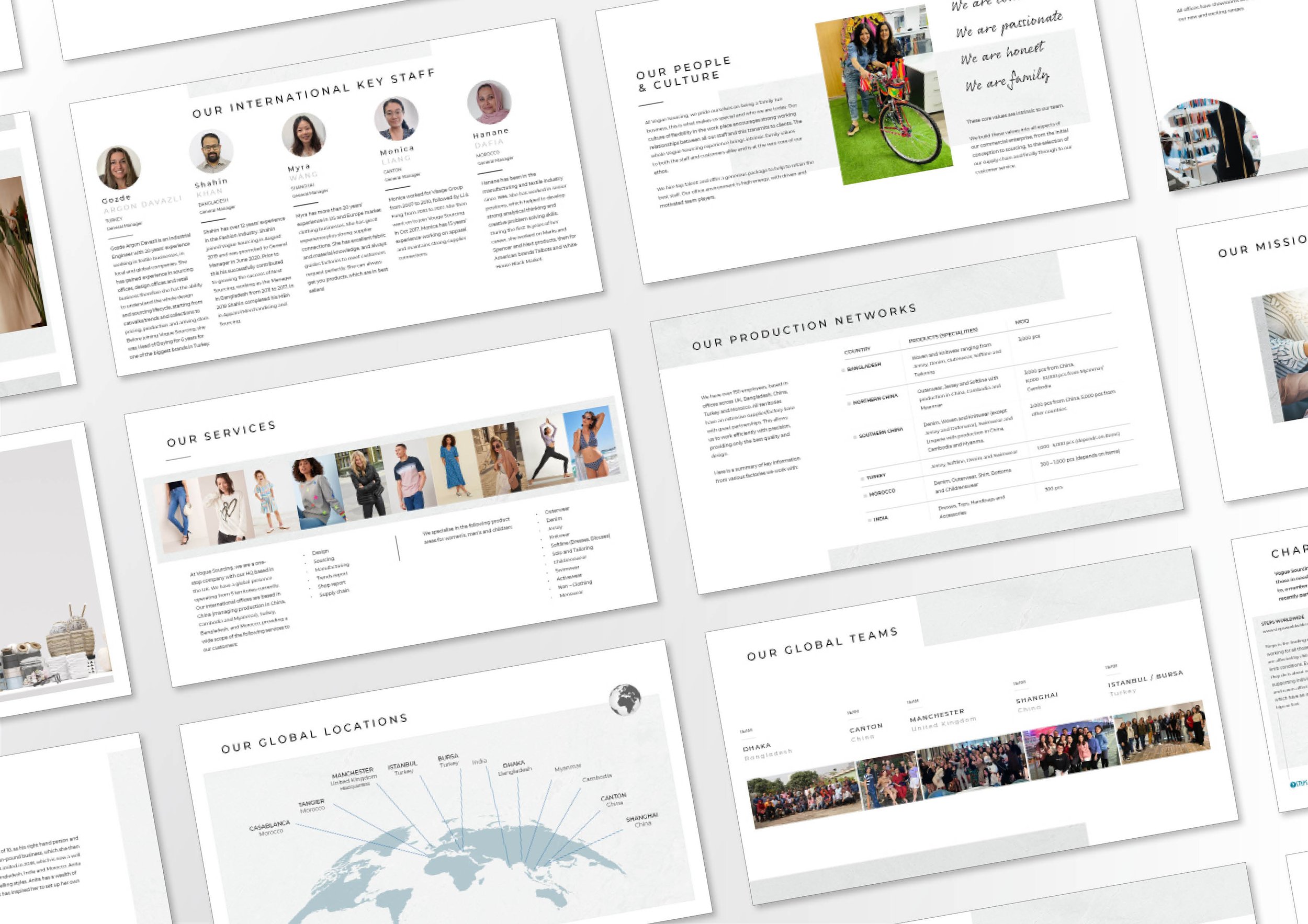
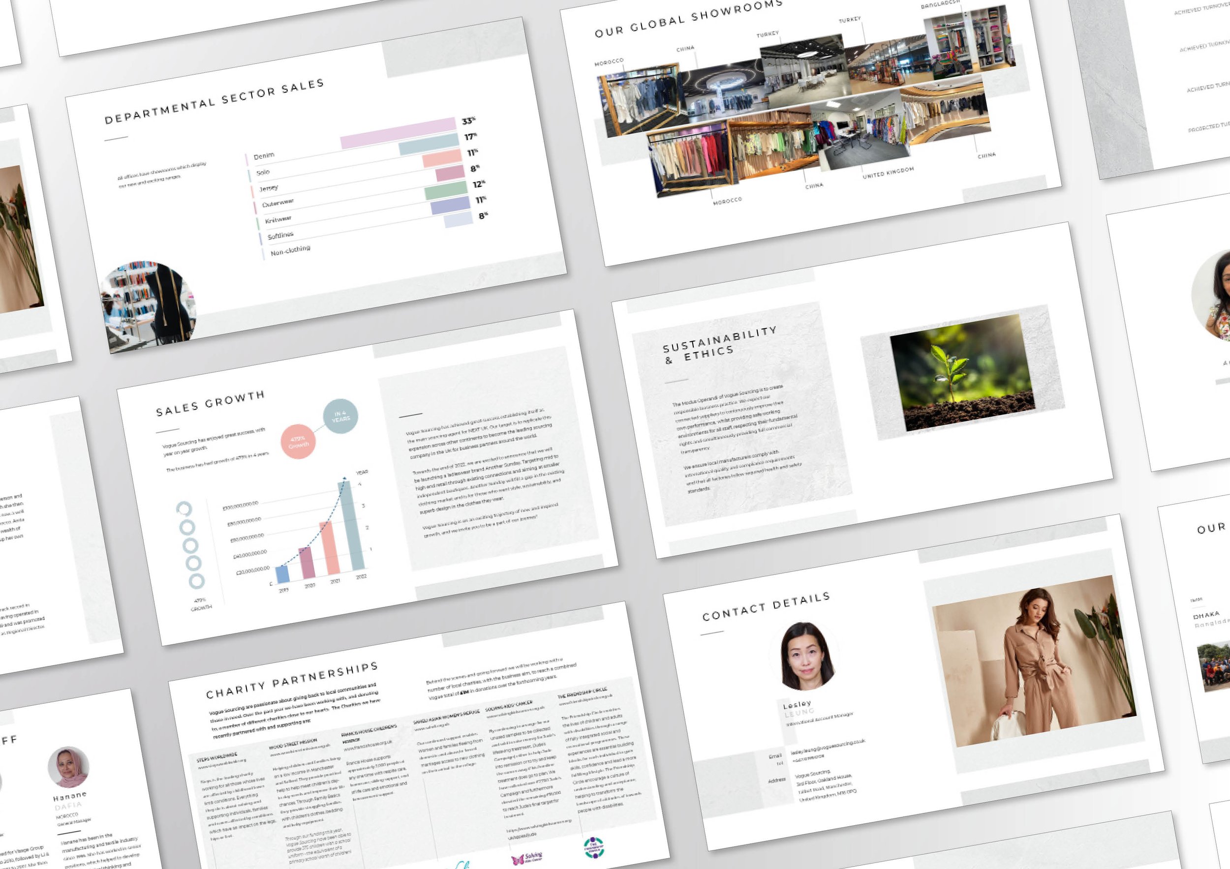
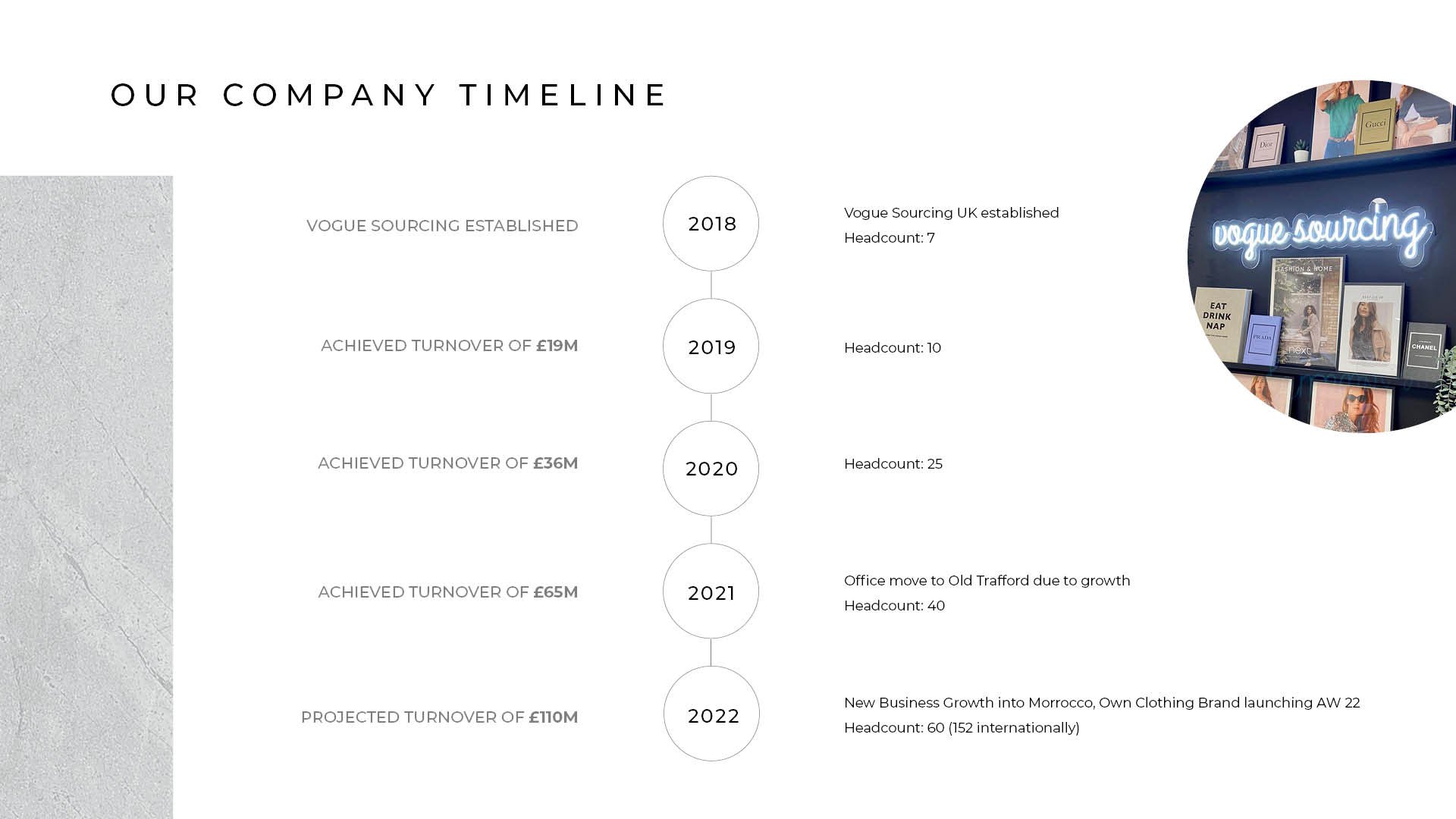
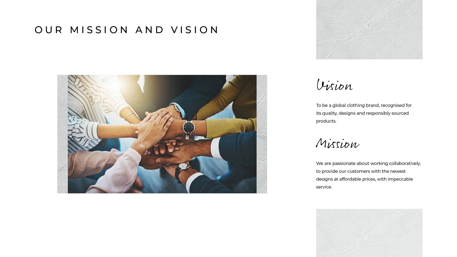
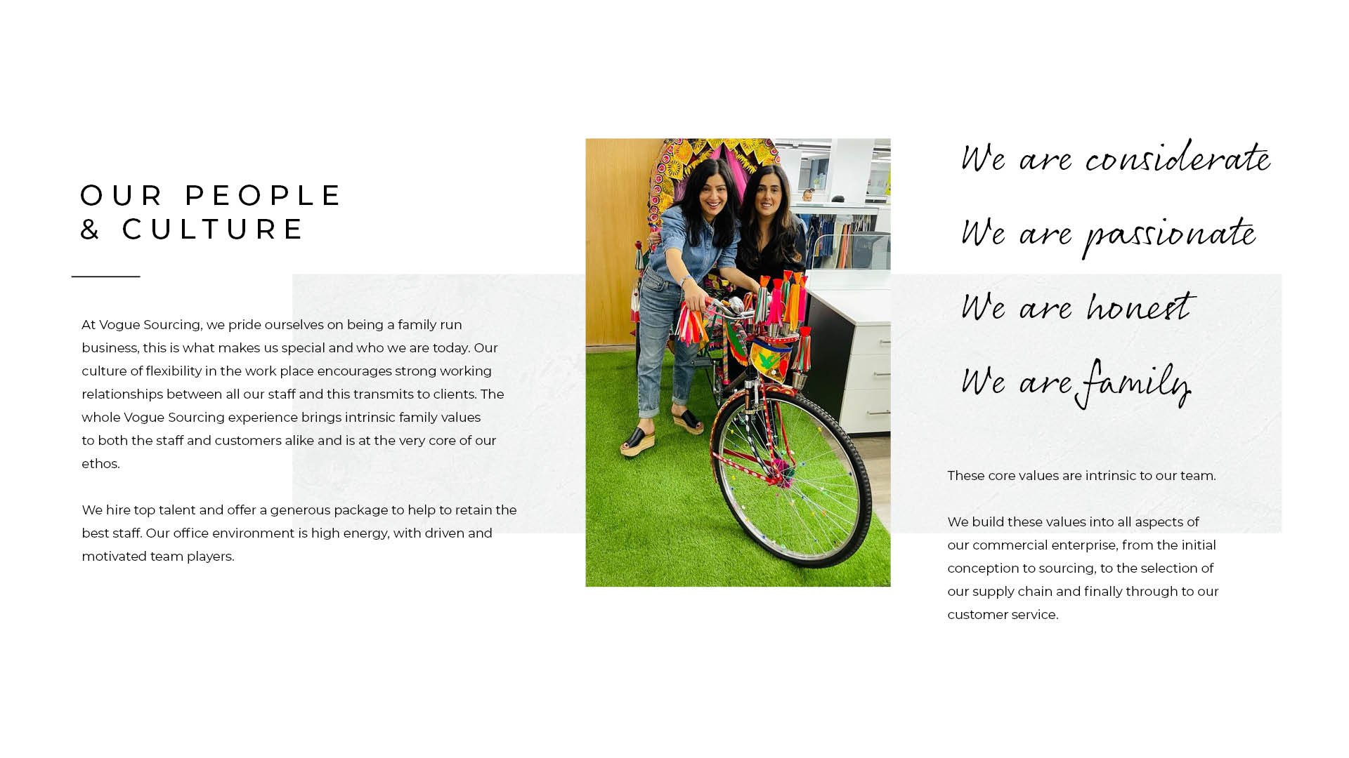
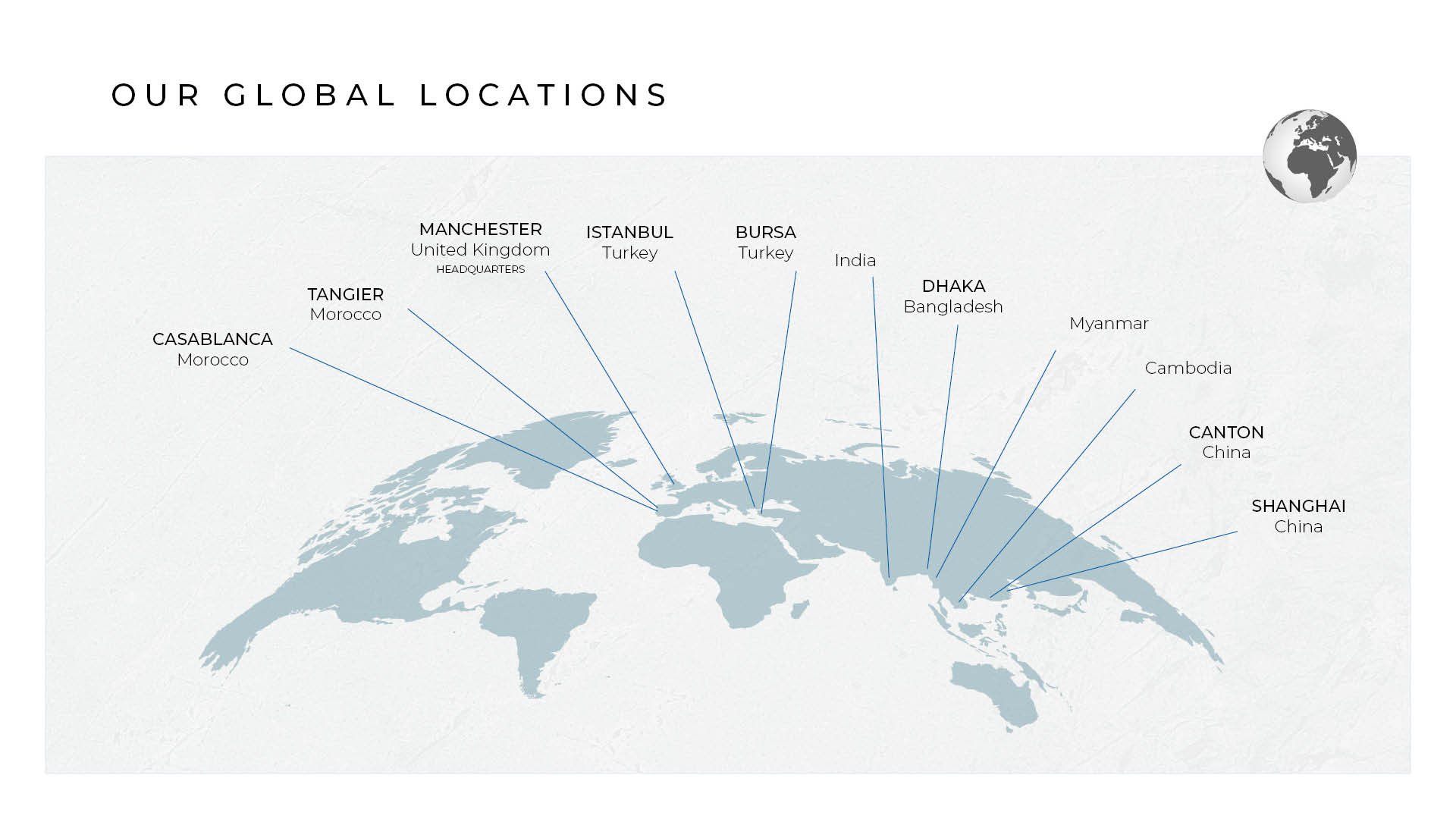
Client Vogue Sourcing
Task Digital Brochure
Special Feature Vogue Sourcing source garments for the high street giants NEXT. The brochure was designed to attract clients globally.
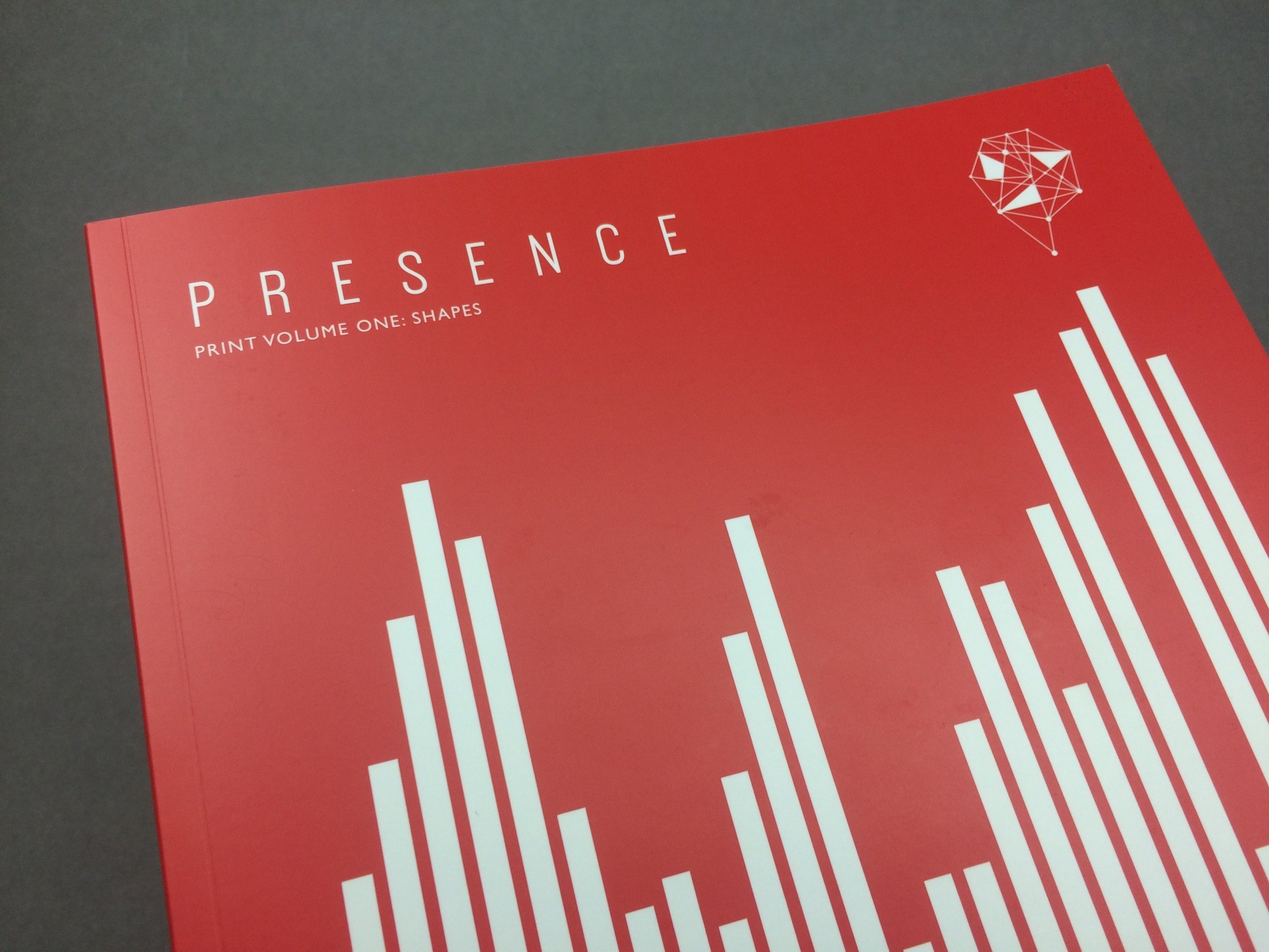
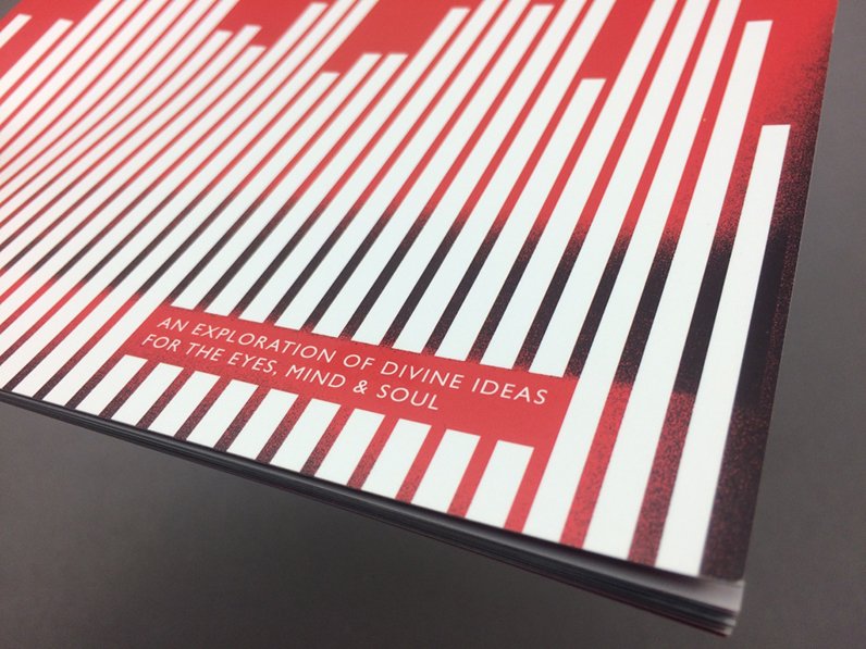
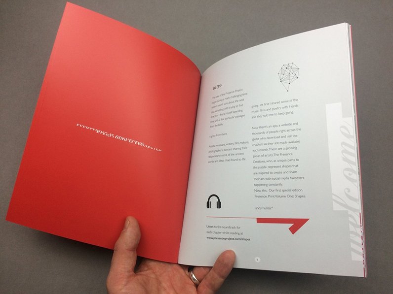
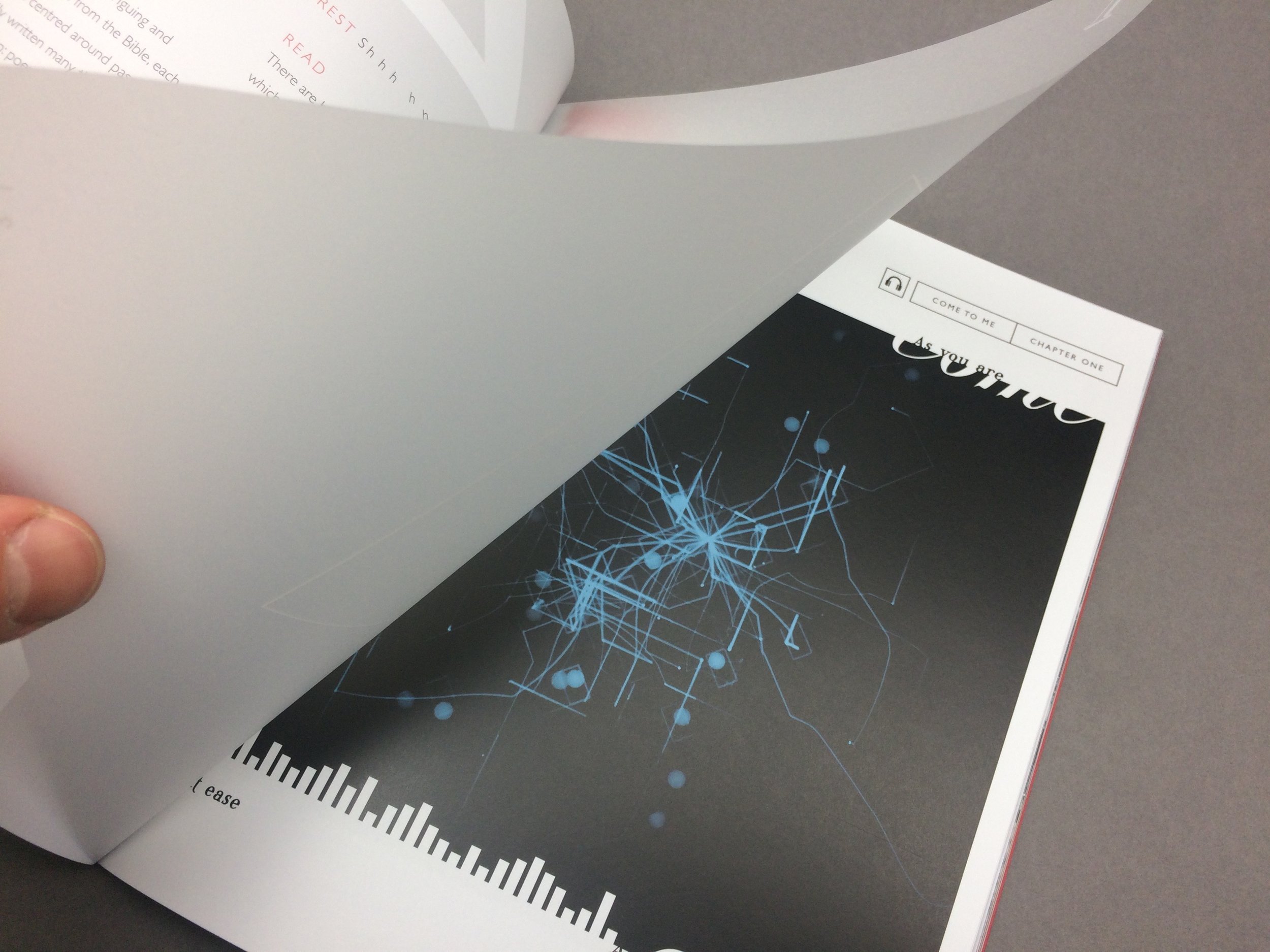
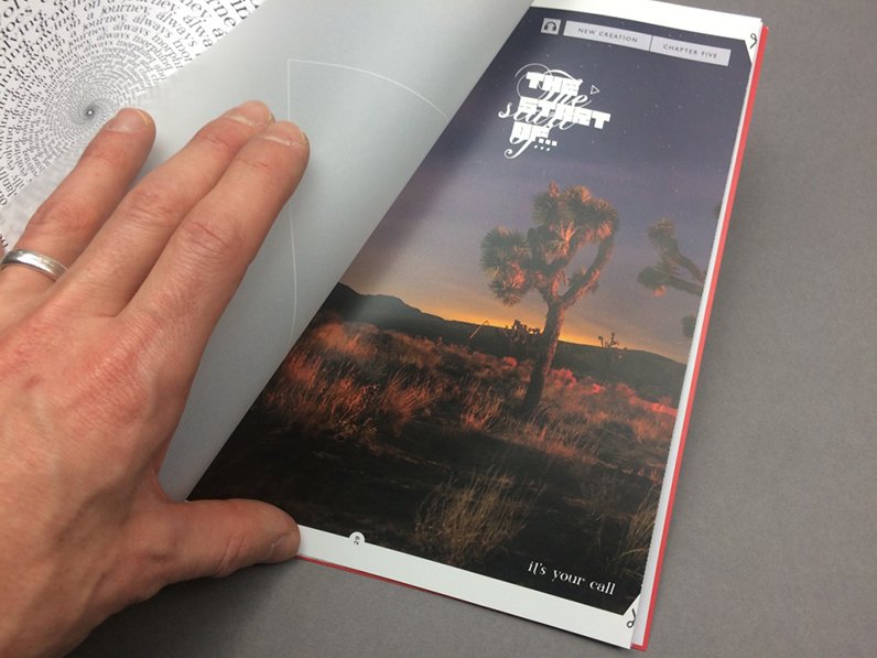
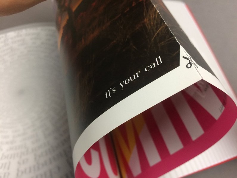
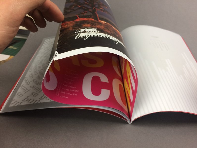
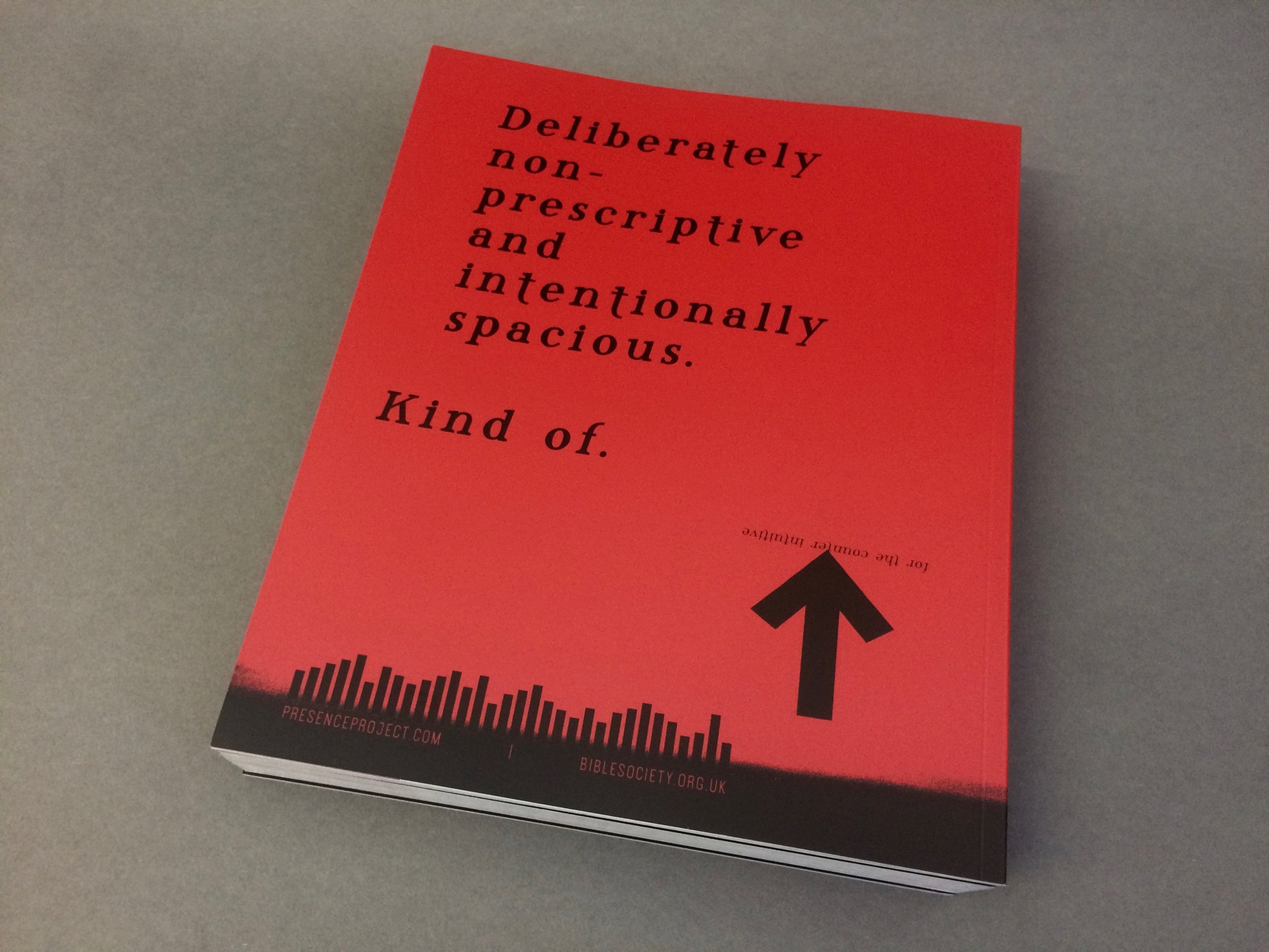
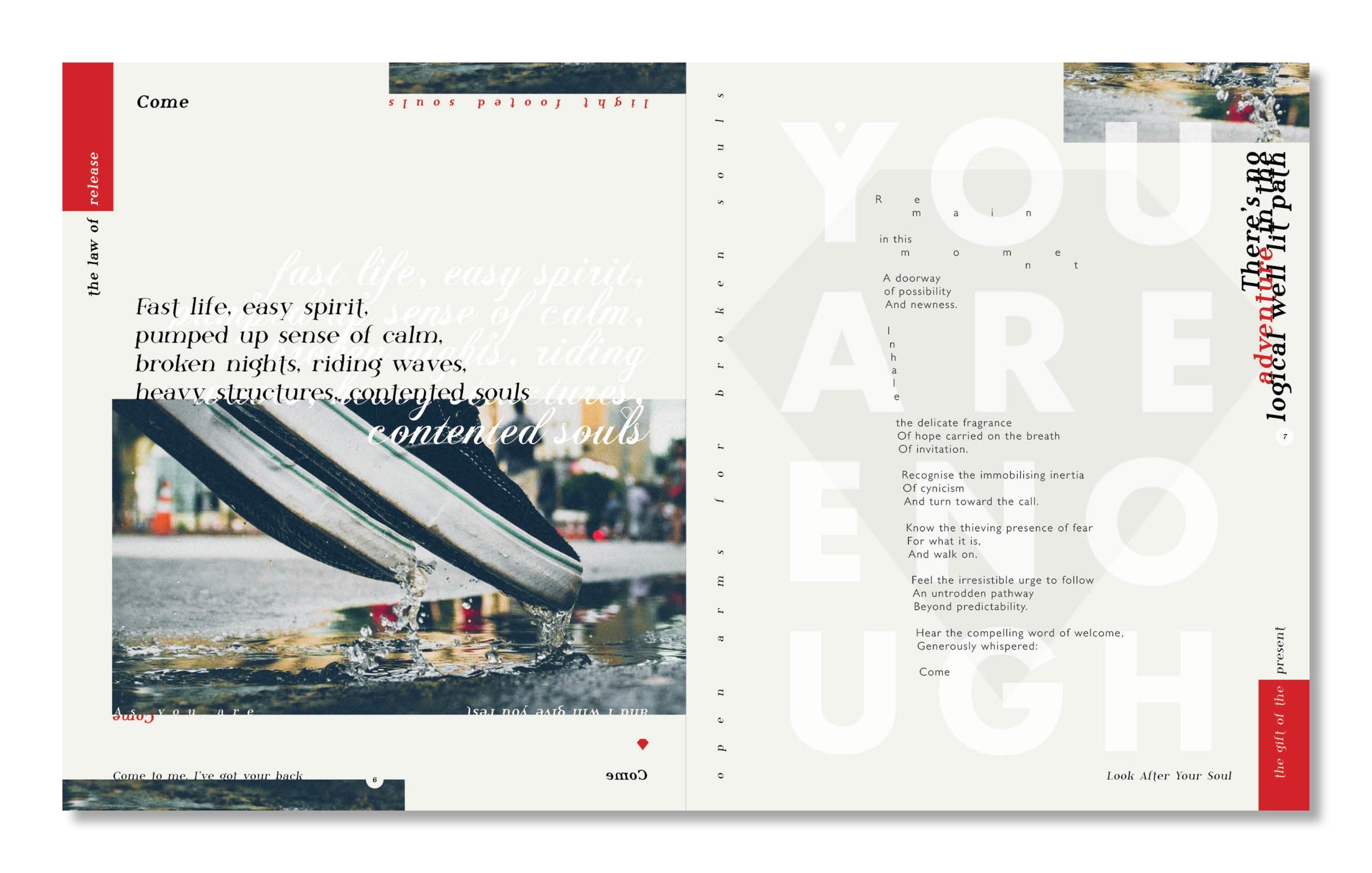
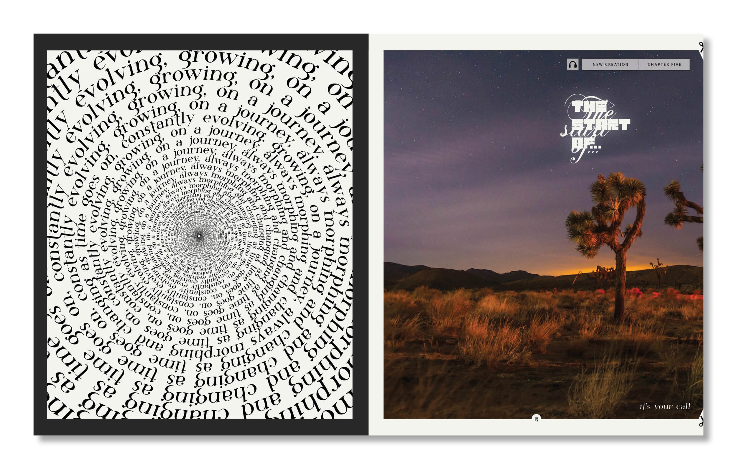
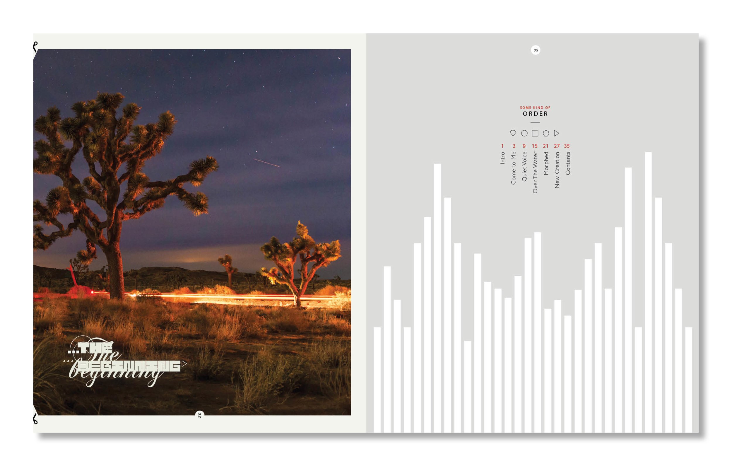
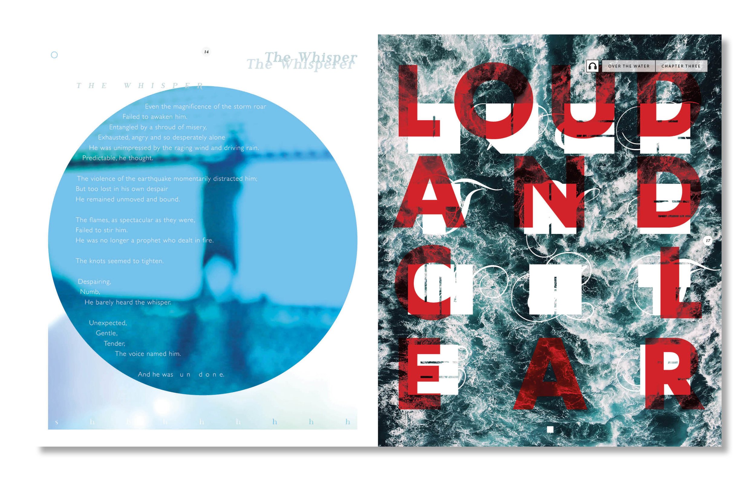
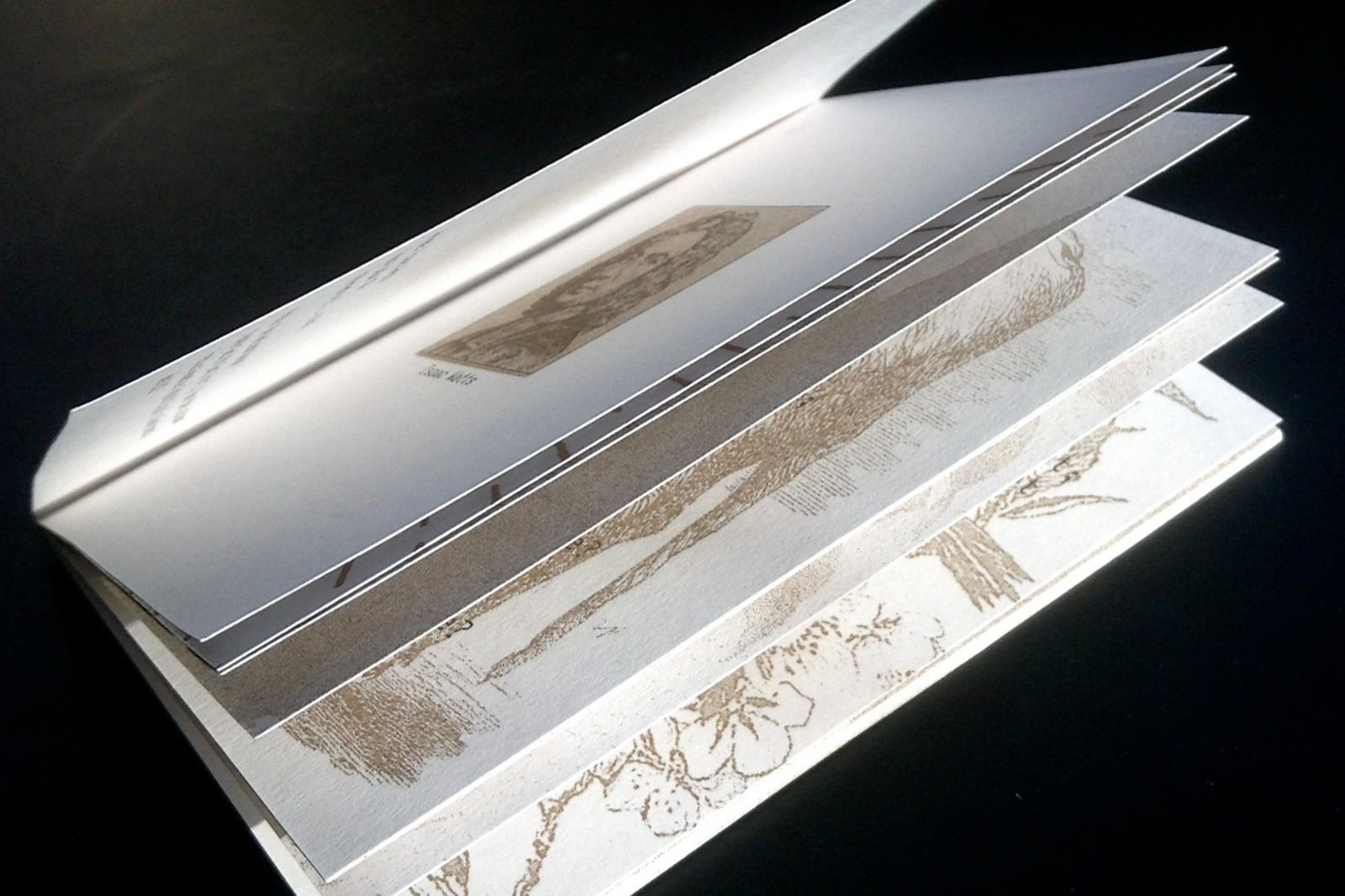
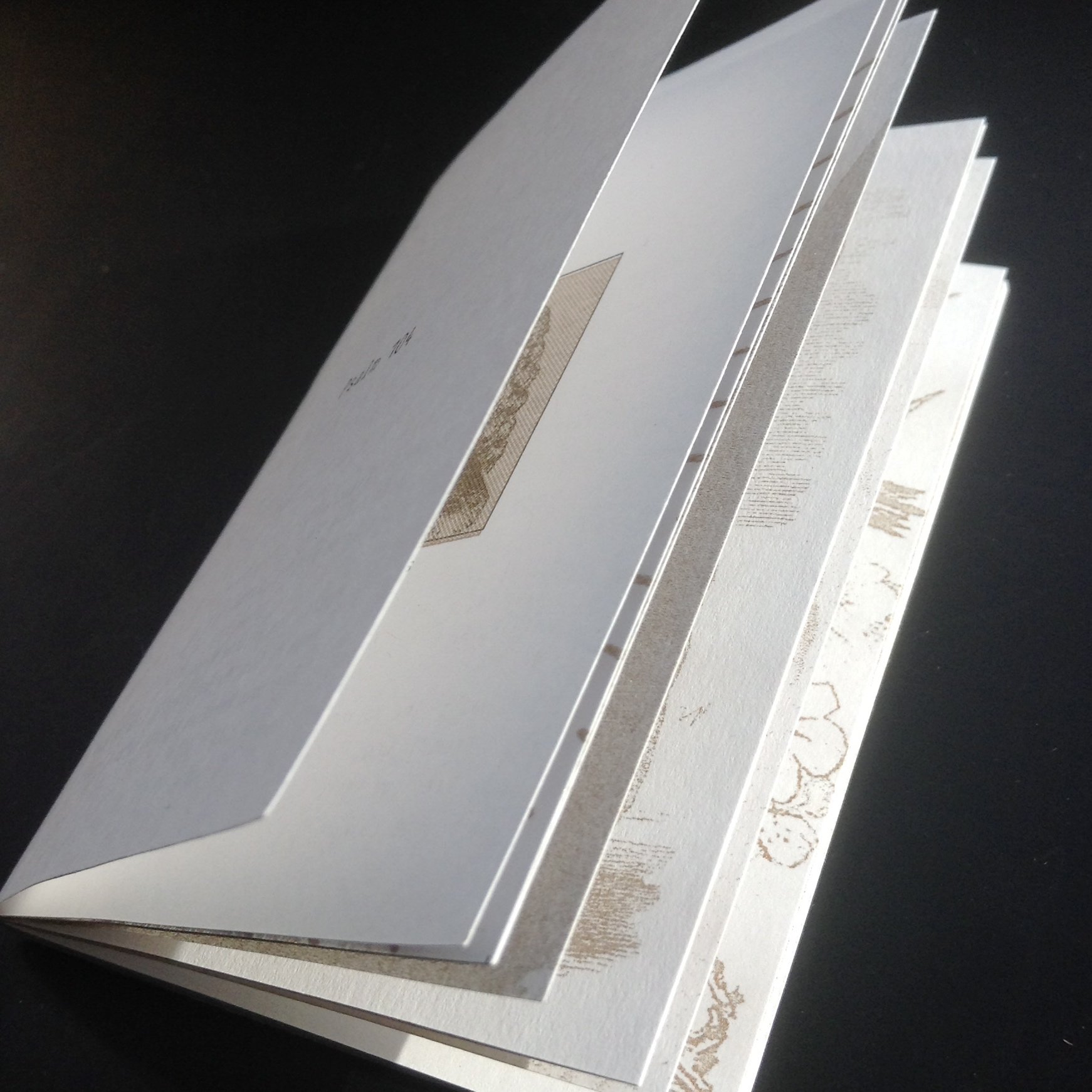
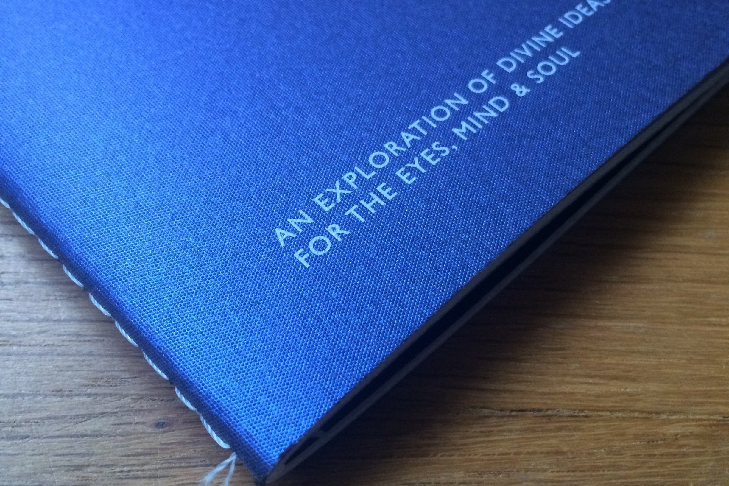
Client Andy Hunter / Bible Society
Task Book Design / Art Direction / Editing
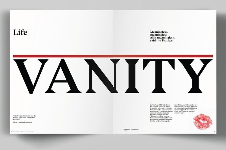
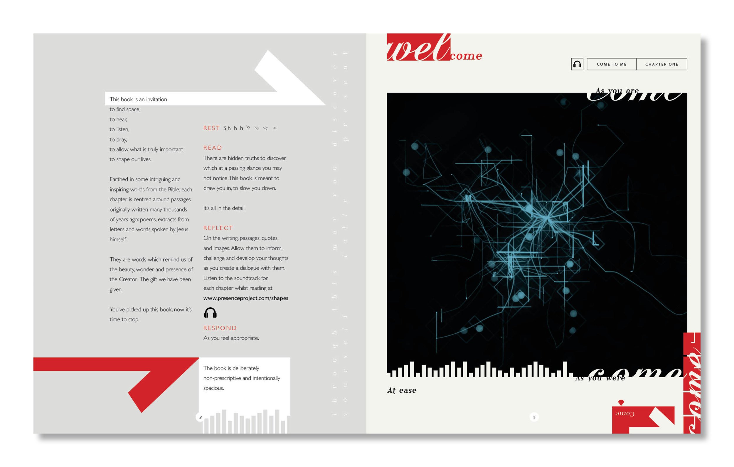
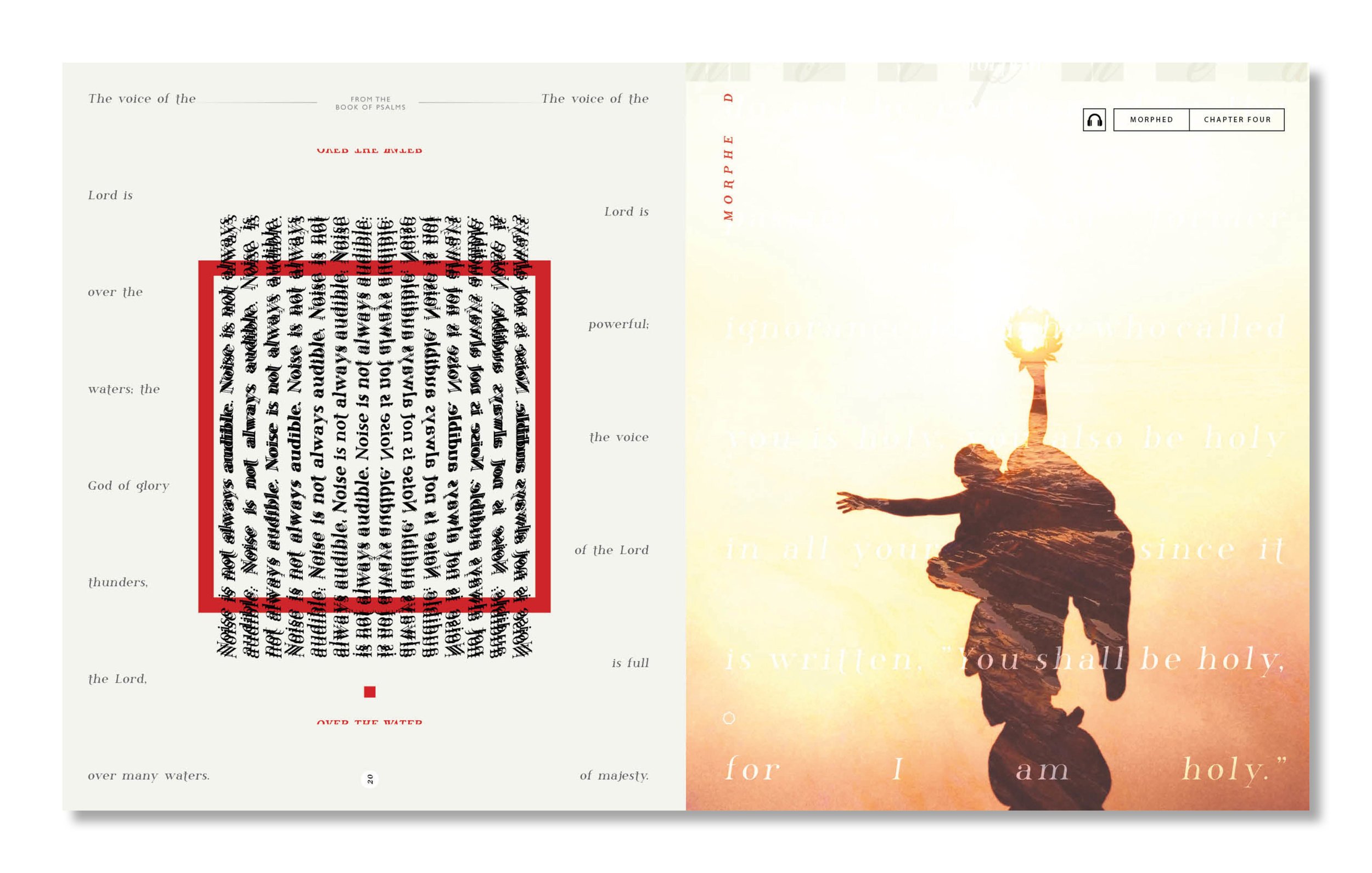
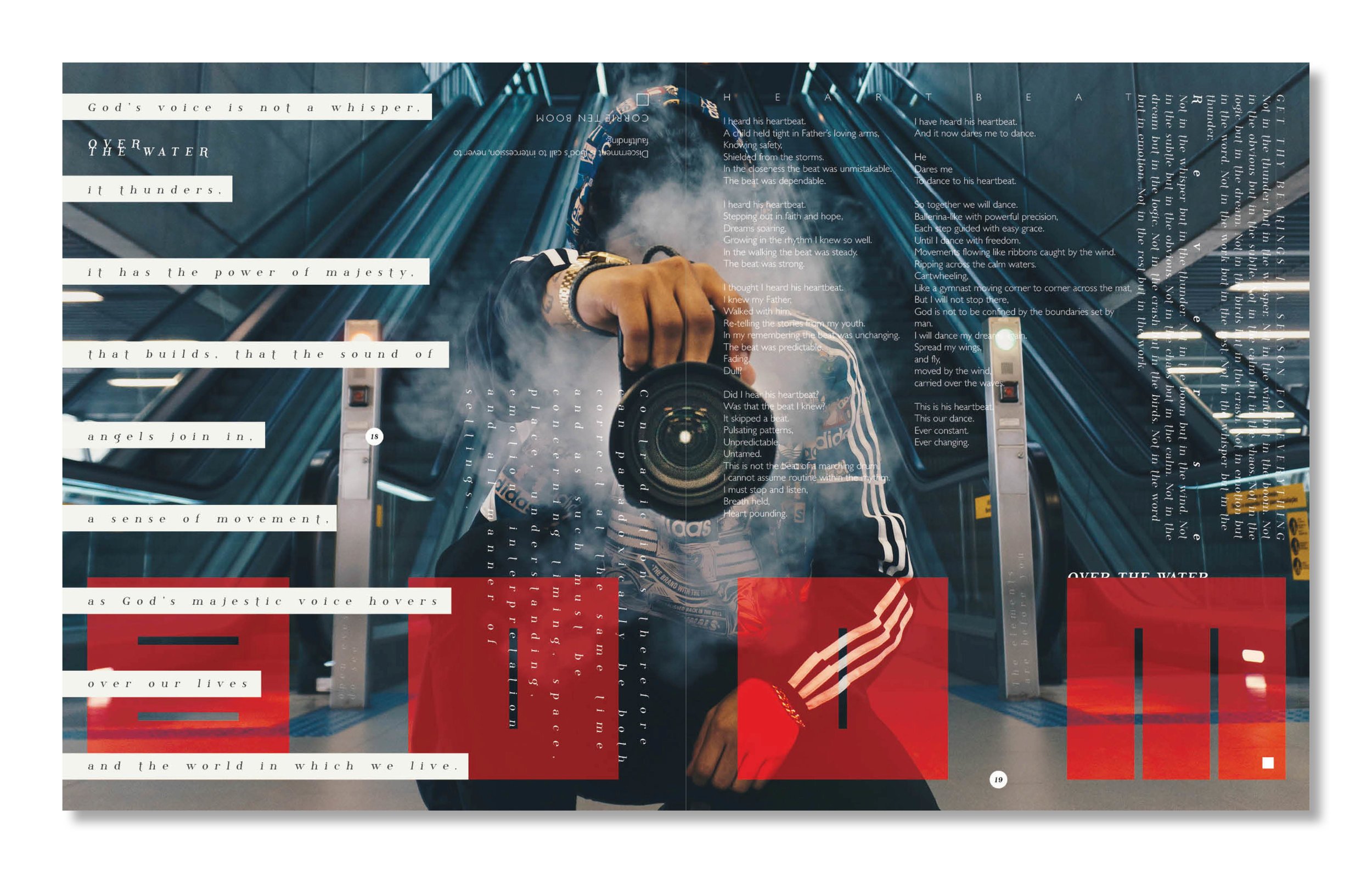
Special Features: This experimental book played with the sense. We used white ink on tracing paper, the finest brilliant white smooth G.F.SMITH stock. The theme of the final of five chapters was titles New Life. Oftentimes, with new beginnings there is a rupture or scar of old left behind, as such we included a French Fold with a perforation, for the reader to tear in order to reveal the final chapters’ content.
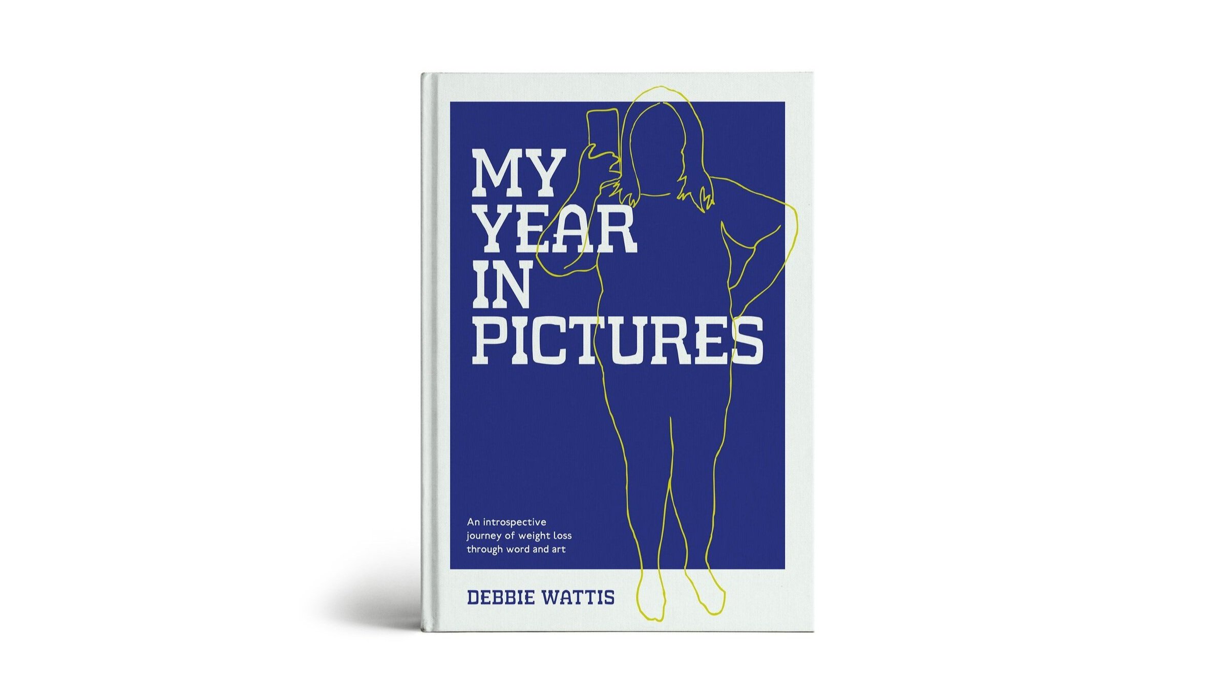
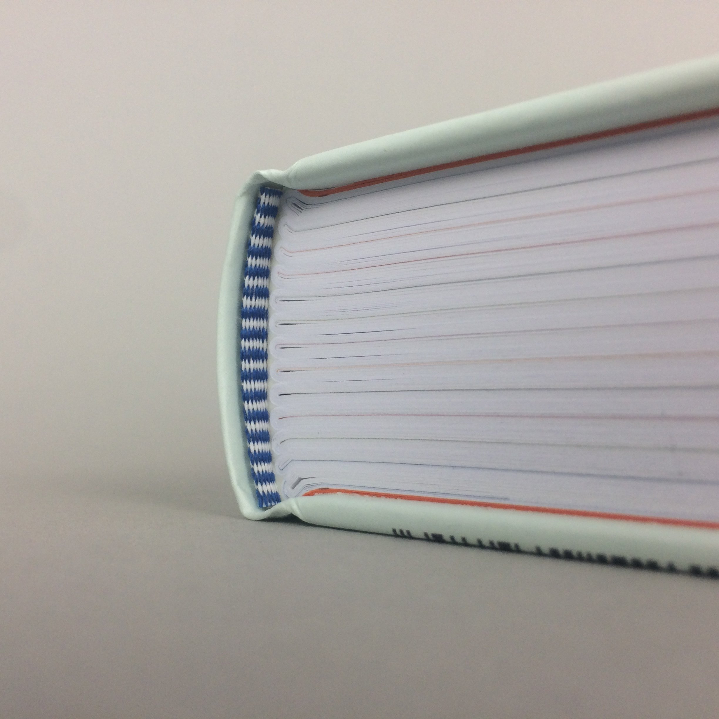
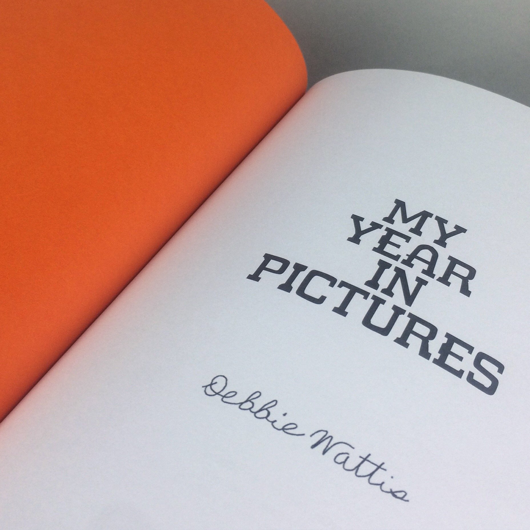
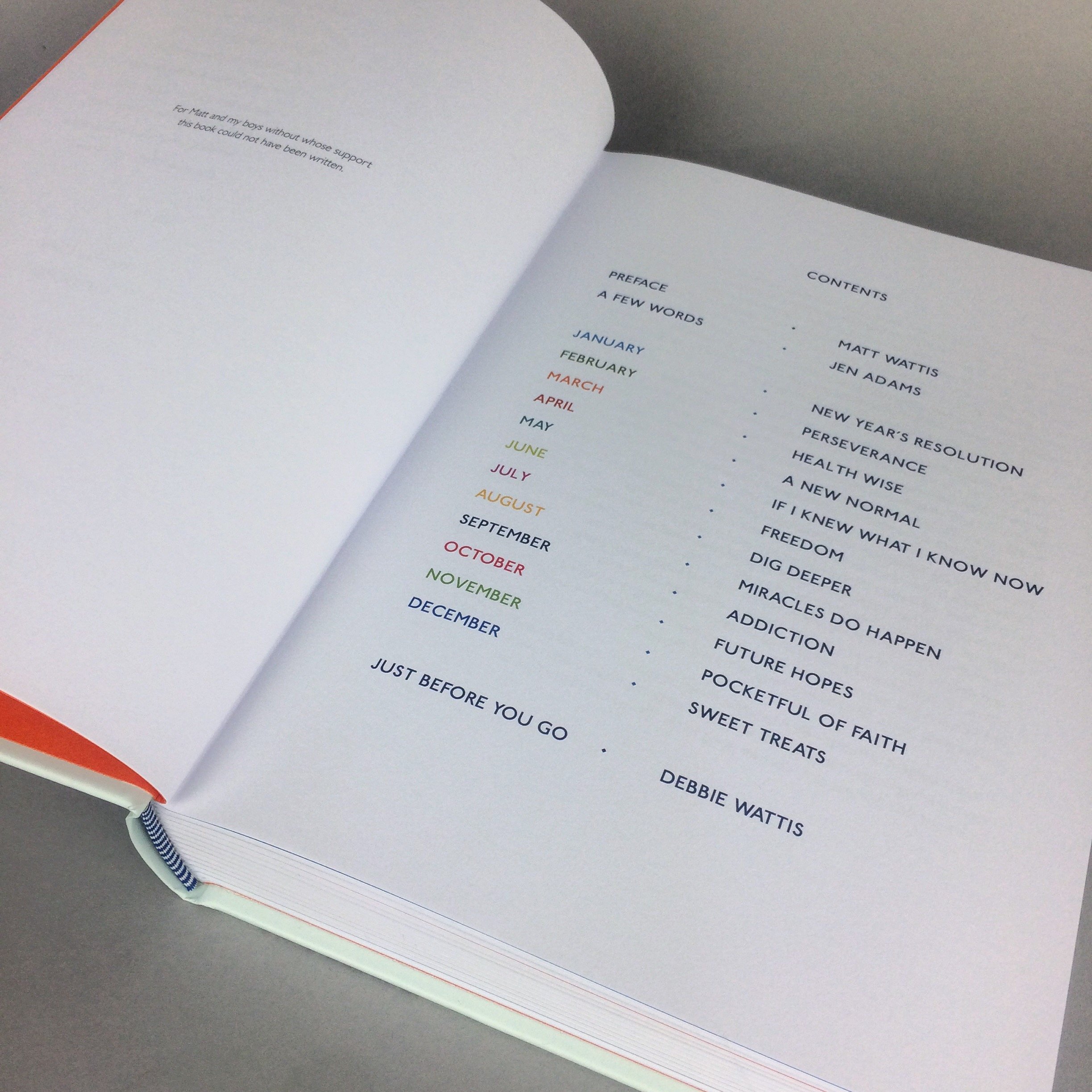
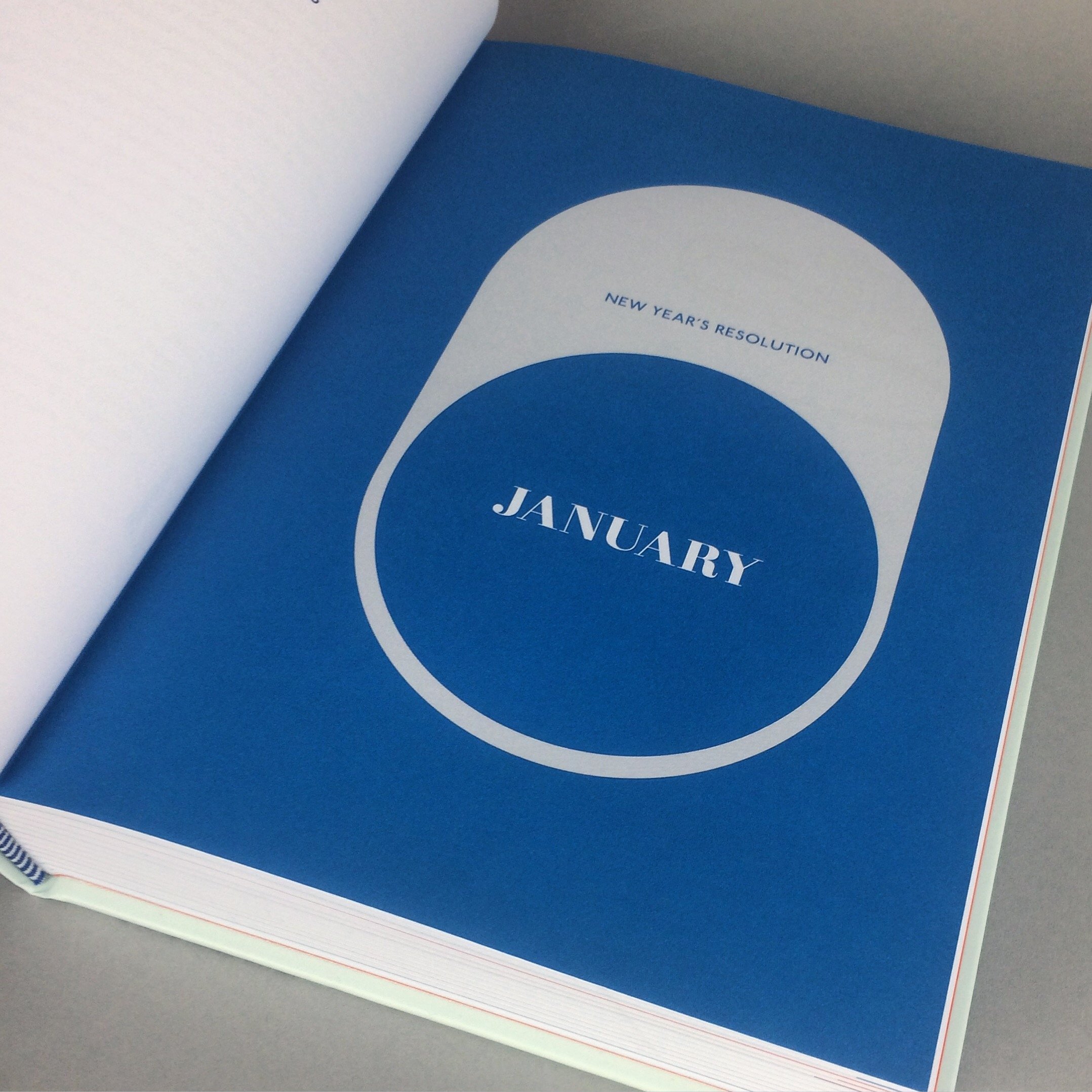
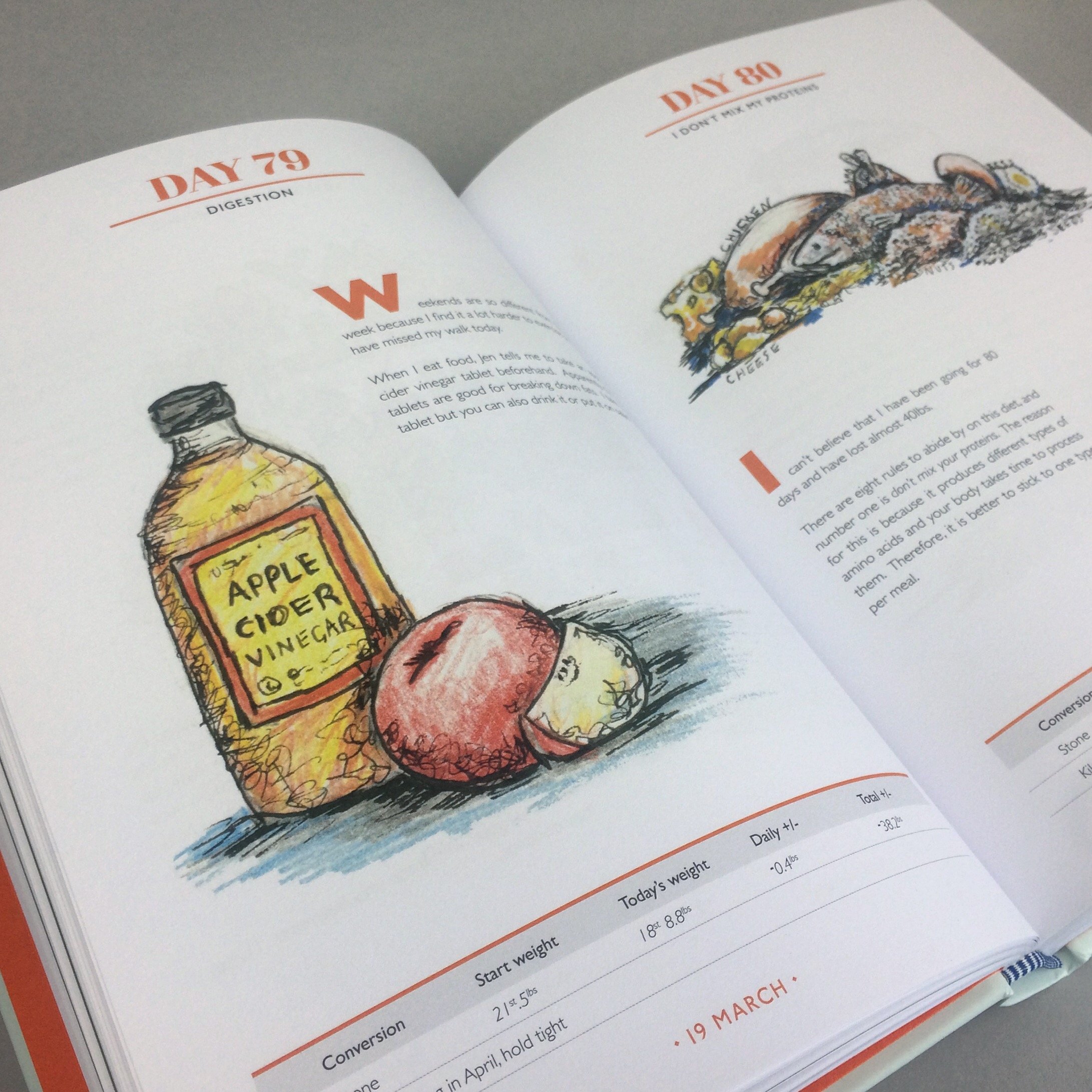
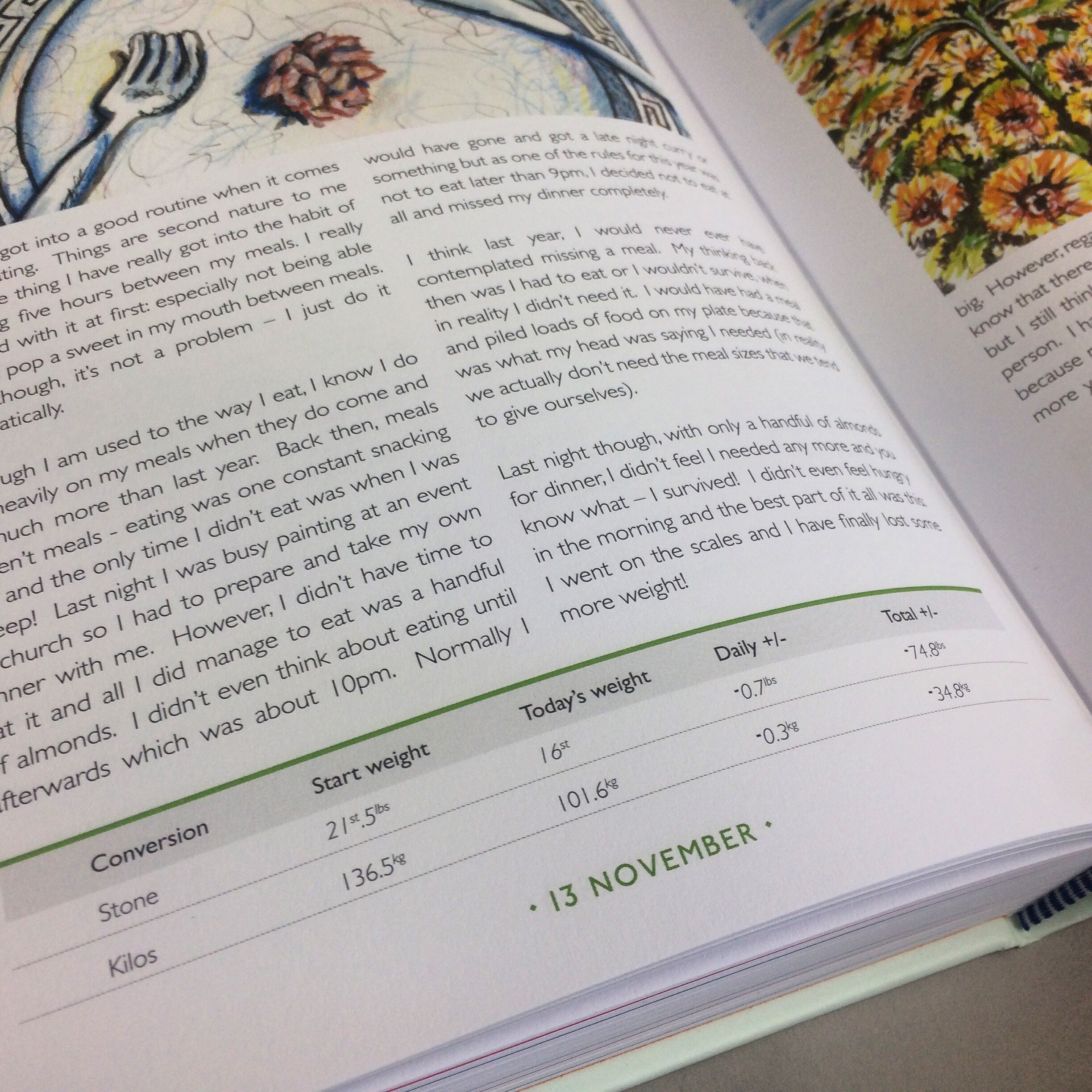
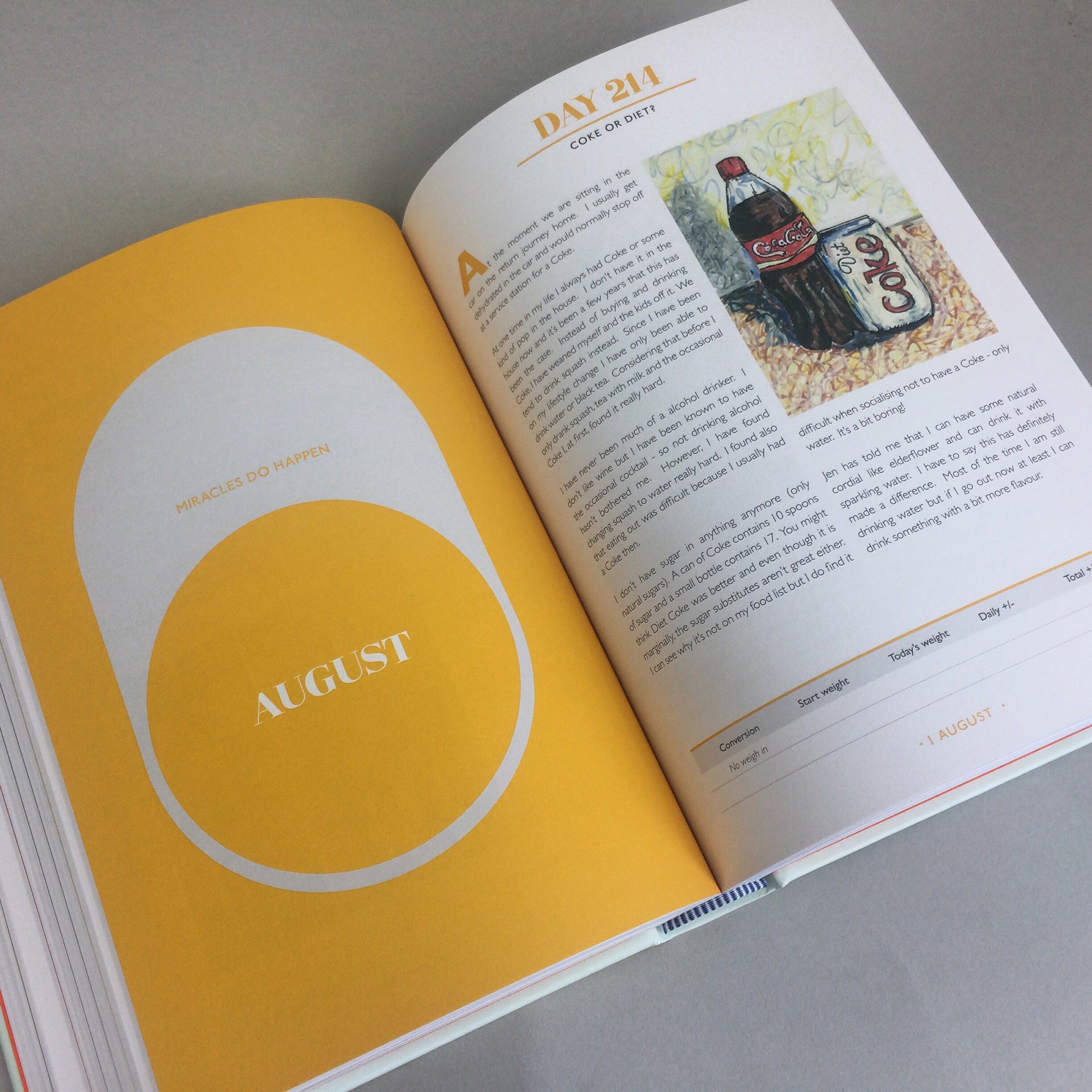
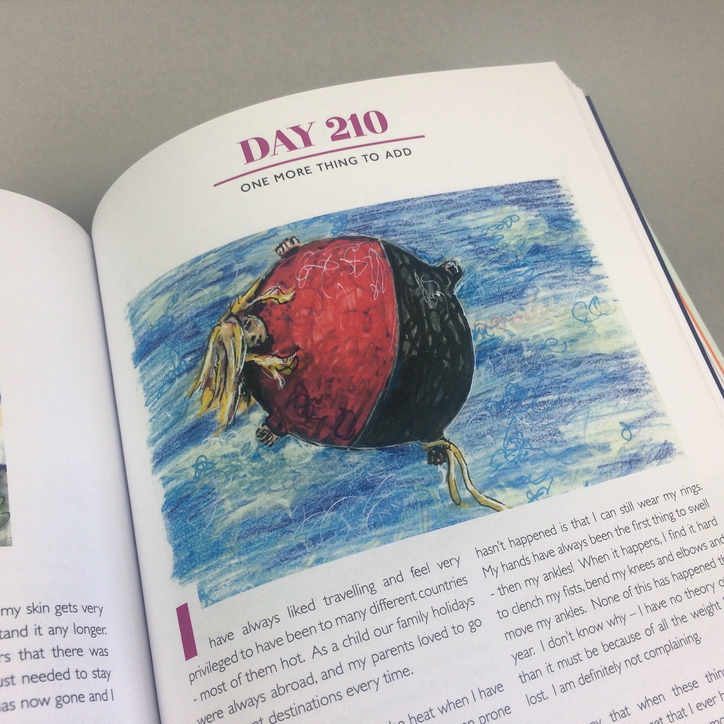
Client Debbie Wattis
Task Book Design / Art Direction
Special Features: My Year in Pictures is the journey of weight loss charted through pictures for every day of a year. The book gained national press attention.
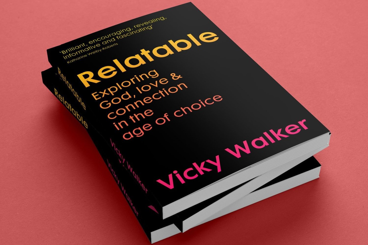
Client Malcolm Down Publishing
Task Cover Design
Special Features: Vicky Walker is a writer, speaker and radio broadcaster fascinated by modern relationships and where faith fits in the world. She has presented on BBC Radio 4's Daily Service and Premier Radio.


Editorial Design
A design led approach centred on narrative flow and visual language.
Working closely with supplied imagery and text, the process considers pacing, scale, silence and composition to shape a publication that feels coherent from cover to close.
Includes
Editorial design and layout / Narrative structure and chapter rhythm / Typographic systems and visual language / Image sequencing, integration and scale / Pull quotes and editorial moments / Print ready artwork / Production consultation throughout
Production Direction
Creative direction carried through to material execution and print.
Alongside the editorial process, production becomes part of the storytelling. Paper stocks, finishes, binding methods and physical details are considered as extensions of the narrative itself, creating moments of texture, surprise and intimacy within the object.Includes
Conceptual production direction / Paper, binding and finish recommendations / Vendor liaison and scheduling / Proof review and colour management / Press oversight / Feasibility studies for special production details
Production Approach
Production is approached conceptually rather than technically. The aim is not embellishment for its own sake, but the creation of tactile experiences that deepen the reader’s connection to the work.
This may involve subtle interventions through paper engineering, binding, material contrast or concealed details that reveal themselves gradually through use.
In certain cases, I may recommend refining standard formats to create a quieter sense of distinction. For example, slightly reducing the height of an A4 format can create a more considered proportion while remaining economically efficient.
Each publication is developed collaboratively, with scope and production direction refined in response to the needs of the project.
Frequently Asked Questions
-
I design books, art books, exhibition catalogues, reports, magazines, journals, brochures and annual publications.
-
Yes. I regularly oversee projects from initial concept and page planning through to artwork, proofing and final print production.
-
Yes. Paper selection, binding methods, finishes and production specifications play an important role in how a publication is experienced.
-
Yes. Publications can be designed for traditional print, digital distribution or both.
-
Yes. Many projects involve close collaboration with photographers, artists, curators and writers.
-
Yes. I work directly with specialist printers and can manage the print process on behalf of clients.